This weekend was pretty busy. We had another earthquake in Latin America—if one includes Haiti as part of Latin America—and the closing of the Olympics. Both have prompted some information graphics that are worth noting and comparing. I am going to leave the New York Times’ explanation of the Chilean earthquake to another post and instead focus here on the Olympics.
I wanted to look at three different visualisations of the Olympics, chiefly centred on the always popular medal count.
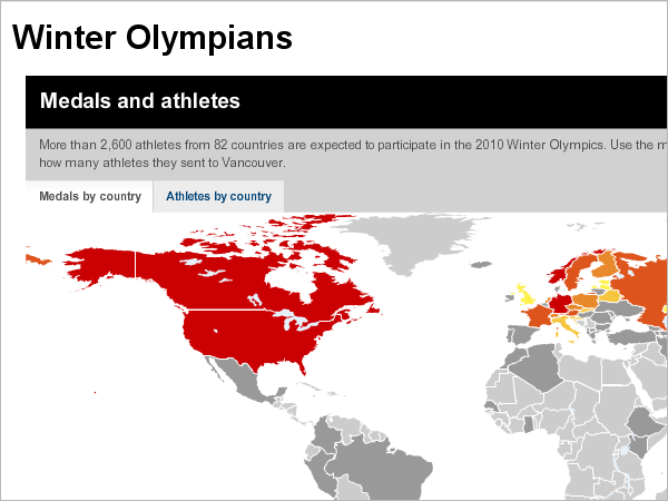
First we have CNN, which dedicates an entire special coverage site to the Winter Olympics. The site has the 2.0-esque feel with different boxes providing the user with different types of material: text-based stories, video, access to an interactive map, and a medal count. The map is what first strikes me because of its warning of reds and oranges and yellows. When I clicked to access the map, however, I felt disappointed in what appeared. And then I wonder why I am being warned about the US and Canada.
Generally speaking, a lot of the world’s landmass did not participate. And of those that did, not a lot won any medals. The vast emptiness of the grey map does a disservice to those much smaller areas of the world, particularly in northern and eastern Europe, that did win but are difficult to see. And, personally speaking, as a fan of Antarctica, I was disappointed to see they neither contributed athletes nor won any medals.
What does work, however, is the idea of highlighting those nations that competed. Perhaps not everybody knows that not every nation competes. The map could have been better executed or even a more stylised visualisation of percentages of regions that competed. 7 nations on the African continent, by my quick count, did compete, while three or four European countries did not. The point is important to make. The visualisation, however, does not support it as well it could.
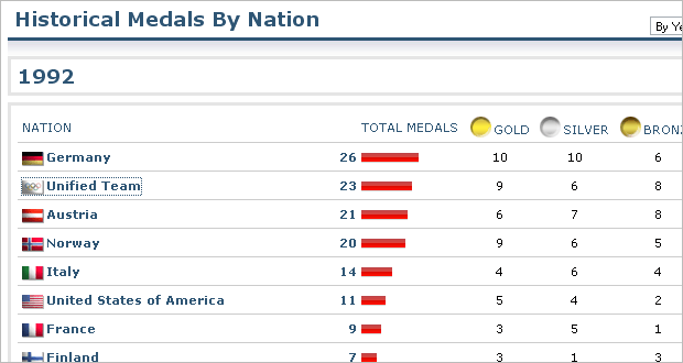
The medal count is also quite interesting from CNN. The special coverage site maintains a snapshot of the leader board that links to the Sports Illustrated medal count. From Sports Illustrated, we are provided a simple table-driven display of who won what with little bar charts to highlight the total medal count. By clicking on a country you see the historical details of the country’s performance, again presented as a table with a bar chart for the total medals won in each year. What I find lacking, however is ranking the countries only by total medals. If someone is more interested in the best gold-medal-winning countries, one has to work to find the data. A simple ability to sort by medal type would be a valuable addition.
An interesting situation arises, however, when looking at the historical figures. I am no expert on the Olympics. I did not watch any of them this year. Nor have I really watched them in the past. However, I do know that sports are added and subtracted. So, by clicking on Germany, for example, we see six medals won in 1936 versus the 36 in 2002. In 1936, however, I count only 51 medals total. In 2002, I count 234 medals. 12% compared to 15%. It does not seem so drastic an increase when put into context.
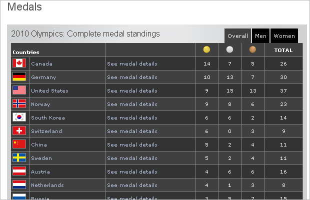
The BBC also has its own special coverage of the Olympics and has its own charts and tables to support the medal count. The main table they chose to use is interesting to me because it is particularly dark compared to the white and grey aesthetic of CNN and the New York Times (below). It certainly stands out. However, when I say ‘it’ I am referring not to the medal count but to the horizontal bands of dark greys and blacks. Between the dark colours, the small type for the medals, and the large flags to identify the countries, I find the medal count last. And when I find it difficult to sort by anything other than the default. But the default is not the total medal count as with CNN. Instead, it is the gold medal count. An interesting choice.
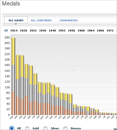
The chart the BBC provides for total medal winnings is also interesting. You can compare across countries, years, and medals. Some of the interface makes it a bit tricky. For several minutes I was trying to figure out which years were which at the outset only to finally realise that I was looking at all years. Perhaps if even all the years were a light weight and then the year selected made bold it would be easier. Or a more noticeable shift in colour.
And then I started trying to discern between countries and was left with three-letter abbreviations for each country. And I could not. Perhaps my inability to figure out which country was which stems from my being an American. But I do like to think that I am pretty good at identifying countries. I thought if I moused over one of the stacked bars the abbreviation would reveal its true meaning to me. But it did not. And so I am left looking at stacks of medals for countries I cannot identify.
The stacked bars are interesting for they are not ideal in comparing medal counts within each country—but the mouseover state provides the required detail. Switching to the country comparison makes it a tad easier, but one must still filter medal by medal. Then aesthetically I do not care for the polished, faux-three-dimensional appearance. Nor do I think most of the bars need to be as wide as they are.
Overall, I like where the BBC was trying to go with lots of cross-comparing and filtering to break down medal counts and historical performance. However, aesthetically, I find too many elements large, bulky and distracting. From large flags and small type to black–grey bands and thick stacked bars, the interface is a tad too cluttered to really allow what the BBC did to show.
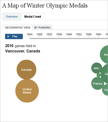
Lastly, I want to look at the New York Times. Like CNN, the Times has created a map of the medal-winning countries in the Olympics, both current and historical. Unlike CNN’s map, however, the map by the Times is not based strictly on geography and each country is represented by a ‘bubble’ whose size corresponds to the number of medals won. I am not particularly keen on bubbles for displaying values. However, by eliminating those parts of the world not participating, the user can instead focus on the results. And those results, while not on a map, are spatially arranged to indicate their regional groupings. For example, the European countries are grouped together and coloured differently from those in North America. Switching tabs quickly reorganises the bubbles into rows ordered by numbers of medals won irrespective of geography.These are interesting design decisions and while I have reservations about using bubbles, the exact figures are provided as one moves his or her mouse over the bubble.
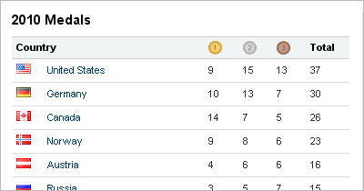
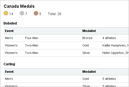
For the medal count, we see another table. The numbers are cleanly presented with small flags to the left—and without the bars of Sports Illustrated. Like both CNN and the BBC, one can dive deeper into a nation’s particular results by clicking on that nation. Yet, the experience of clicking into a nation is much smoother with the Times than with the others. No additional pages load and I am not watching my screen jump about to and fro. Instead, the additional information loads in a panel to the right of my click. It is a quick and clean transition that does not leave my frustrated by jumping browser windows.
Yet, the additional information loaded is quite text heavy. And with the exception of the headers for each sport, nothing in particular stands out. Not the sport, not the medal won, not the athlete who won the medal. While the quiet type is aesthetically pleasing, it lacks punch. Instead of reading the words gold, silver or bronze—since we are looking at the medals—perhaps just their icons could be used. Perhaps the athlete is in bold. I would just like something to which my eyes can be drawn in the table.
The New York Times effort is brilliant work. Clean and simple design brings out the information—even if such information is presented in the forms of bubbles and such. Tables are rather clean and easy to read. I think their effort a success. Not perfect, as I find the more detailed table insufficient in terms of visual distinction, but still a success.
All of the efforts are significant and worthy of mention. Each has some flaws and each has some strengths. And admittedly, each is more complex and detailed than I have described and commented upon here. But I have to stop somewhere.
Leave a Reply
You must be logged in to post a comment.