Pie Charts v Bar Charts, Round…Some Really High Number
Not strictly a commentary on a piece or project, instead, this is a link to an interesting opinion piece about the Great Infographic Debate, i.e., most loosely and least helpfully, substance vs. style, vis-a-vis the use of pie charts and such vs. bar charts. Where does one draw the line between clear communication and, frankly, just getting somebody’s attention so that one can communicate?
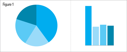
From the article, an illustration of just how bar charts are significantly better than pie charts at clearly communicating data such as which is the largest data point.
Thanks to Ben for the heads up.
Author: Brendan Barry
I am a graphic designer who focuses on information design. My day job? Well, they asked me not to say. But to be clear, this blog is my something I do on my own time and does not represent the views of…my employers. I think what I can say is that given my interest in information design—be it in the shape of clear charts, maps, diagrams, or wayfinding systems—I am fortunate that my day job focuses on data visualisation. Outside of work, I try to stay busy with personal design work. Away from the world of design, I have become an amateur genealogist and family historian. You will sometimes see that area of work bleed into my posts.
View all posts by Brendan Barry
One thought on “Pie Charts v Bar Charts, Round…Some Really High Number”
UTBwC1 lvqvofznlwiz