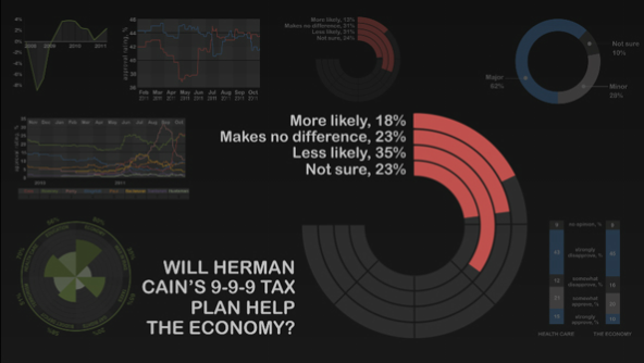
We are now just under 365 days away from Election Day 2012. Without a doubt, I shall have many politically-themed graphics coming. People just have to start making them. But for now, the Economist kicked it off Monday—when it was 365 days—with a motion graphic piece that outlines some of the polling numbers and challenges to the Republicans vying for power and President Obama determined to keep it.

Certain types of the chart are very much not helpful in determining the actual numerical comparisons. But, with the voiceover keeping our attention and explaining what is going on with the charts, it is as always interesting to experience a story told in charts and graphs for nearly three minutes. And about a story with real significance.
Leave a Reply
You must be logged in to post a comment.