Maps are cool. They show the geographic distribution of data. And that is fantastic if there is a story in said distribution. But even if there is a story, sometimes given both the scale of the map and the amount of data encoded in the map, how could you possibly expect to find the story? Which little region of the map do you search to find the interesting nuggets?
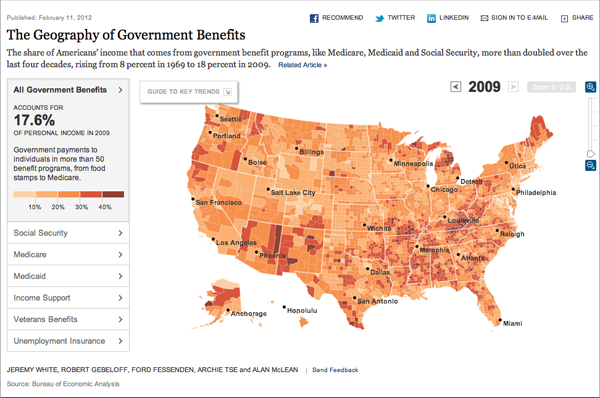
On Sunday, the New York Times published an interesting solution to that very quandary. The context is an article looking at the anger and resentment felt by some towards government assistance via the social safety net, and yet how these very same people depend upon that safety net through programmes like Social Security, Medicare, Medicaid, &c. The map, a choropleth, examines several different metrics that comprise government assistance, e.g. Medicaid payments as a percentage of income.

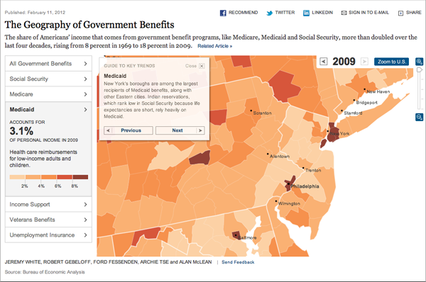
One can easily toggle through the various metrics at the scale of the entire United States. This is a rather standard feature for such maps. However, in the upper-left corner, the designers placed a ‘guide’ that provides context and stories for each metric. But, not only does the guide provide text to support the map, but it zooms in on specific areas and regions that then support the text and best exemplify the point.
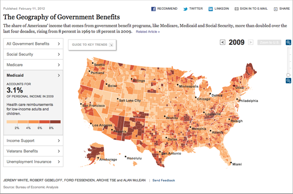
Here we see the map of the whole US for Medicaid, which appears to be scattered pockets of higher percentages. Interesting perhaps, but the user likely has few ideas as to what that visualisation actually means.

Compare that to the guide’s view of the map, which focuses on the large cities on the East Coast.

Providing context and guiding a reader/user through the stories contained in the map, or at least those deemed interesting by the designers and editors, is an interesting solution to the problem of finding the story in maps such as these. However, by moving away from a strict visualisation of the data, the New York Times and others that try similar avenues introduce human biases in the story-telling that may otherwise be unwanted or distracting.
Credit for the piece goes to Jeremy White, Robert Gebeloff, Ford Fessenden, Archie Tse and Alan McLean.
Leave a Reply
You must be logged in to post a comment.