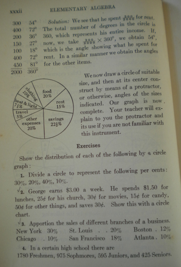
Another image from my 1930s algebra book is on pie charts, or what was then called circle charts. And while the utility of such a chart form has not changed, especially in these examples, the circle chart of the 1930s had one particular good use for students. Constructing it.

Today a student plugs in numbers into a spreadsheet in Google Docs, Excel, or Open Office. He or she presses a button and the circle chart is done. Back in the 1930s, students needed to convert absolutes to percentages and then use protractors to draw the slices on pieces of paper. Fancy that, students having to do math to make a chart.
Leave a Reply
You must be logged in to post a comment.