The previous two entries have been about visualisations of the administration’s budget proposal for 2013. Today’s will be (probably) the last in such a theme. Perhaps some wonder if not the bubbles and circles of the Times’ visualisation, what?
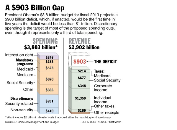
Some might answer bar charts. Because we all love bar charts. But, as in this example from the Philadelphia Inquirer, sometimes we are left wanting more.

The graphic captures the size of the budget by general spending and revenue areas, but misses the story on how each has changed on account of this new era of austerity. What colour was in the previous examples, here instead we see it used to group the different categories of spending. From an aesthetic standpoint, the depth in the third dimension is distracting and the space between the two stacked bars (and the line separating them) does not aid in comparison.
In brief review, of the three visualisations presented over the past three days, I have to say that the Washington Post’s tree maps are the most useful from a design perspective, but sadly lacks in the granularity we see—regardless of the clarity or lack thereof in presentation—in the piece from the New York Times.
Credit for the piece goes to John Duchneskie.
Leave a Reply
You must be logged in to post a comment.