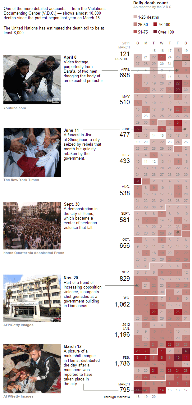
The civil war in Syria rages on. The following graphic from the New York Times accompanies the article and uses a calendar-style timeline to look at the mounting death toll. The visualisation type appears more and more often for time-based data sets shaped around days; we all (usually) understand how calendars work and are shaped.
In this particular case, specific key dates and images are brought out of the timeline and featured on the left. These provide an additional context to the human side of the story that may otherwise be left in the dates and deaths on the right.
A problem with such a design is the length of the year, which might preclude users of small screens from being able to see the entire year in one screen-height. I am left to wonder about whether the user can make an adjustment to a horizontally-scrolling calendar and if in the future such arrangements may better take advantage of widescreen monitors.

Leave a Reply
You must be logged in to post a comment.