Follow the money is almost always good advice. And in this case, the journalists over at ProPublica have done just that. They have visualised just where the campaign (and Super PAC) dollars are going using an interactive Sankey diagram.
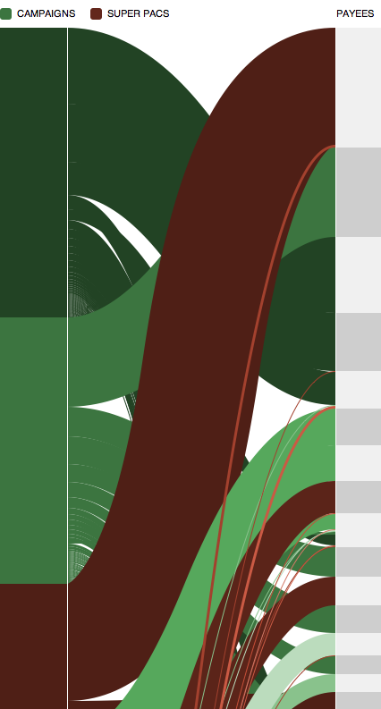
And then for those interested in how this was made, ProPublica provides those details as well.
Via my colleague Lauren Beth.
Credit goes to Al Shaw, Kim Barker, and Justin Elliott.
Author: Brendan Barry
I am a graphic designer who focuses on information design. My day job? Well, they asked me not to say. But to be clear, this blog is my something I do on my own time and does not represent the views of…my employers. I think what I can say is that given my interest in information design—be it in the shape of clear charts, maps, diagrams, or wayfinding systems—I am fortunate that my day job focuses on data visualisation. Outside of work, I try to stay busy with personal design work. Away from the world of design, I have become an amateur genealogist and family historian. You will sometimes see that area of work bleed into my posts.
View all posts by Brendan Barry