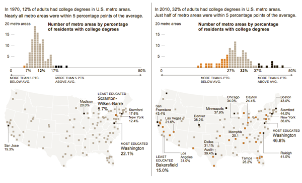
Last week, the New York Times looked at the growing education gap amongst this country’s largest metropolitan areas. The infographic, click the image below to go to the full version, is perhaps a bit more layered, nuanced, and complex than it looks at first. In about forty years, the number of adults with college degrees has doubled, good, but so too has the spread of those numbers across the set of cities, bad. And then to look at any geographic spread, the two datasets are mapped geospatially. By my eye, the Northeast and Pacific Northwest seem to be doing fairly well. Not so much around the rest of the country.

Credit for the piece goes to Haeyoun Park.
Leave a Reply
You must be logged in to post a comment.