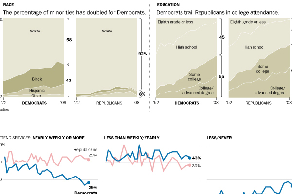
This past weekend the Washington Post published an infographic looking at how the Democratic Party has demographically changed over time and compared those changes to those in the Republican Party. The piece is large, but shows some interesting trends particularly with the racial diversification of the political parties—or lack thereof. It is an important trend when considering the white population is growing at much slower pace than minority groups.
Author: Brendan Barry
I am a graphic designer who focuses on information design. My day job? Well, they asked me not to say. But to be clear, this blog is my something I do on my own time and does not represent the views of…my employers. I think what I can say is that given my interest in information design—be it in the shape of clear charts, maps, diagrams, or wayfinding systems—I am fortunate that my day job focuses on data visualisation. Outside of work, I try to stay busy with personal design work. Away from the world of design, I have become an amateur genealogist and family historian. You will sometimes see that area of work bleed into my posts.
View all posts by Brendan Barry