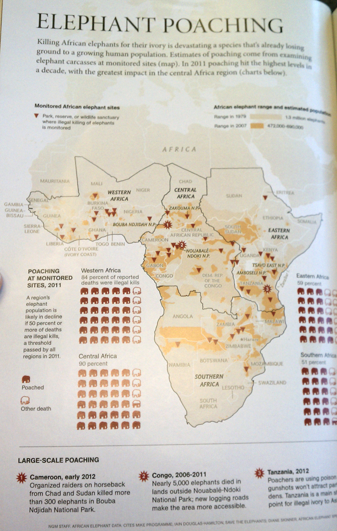
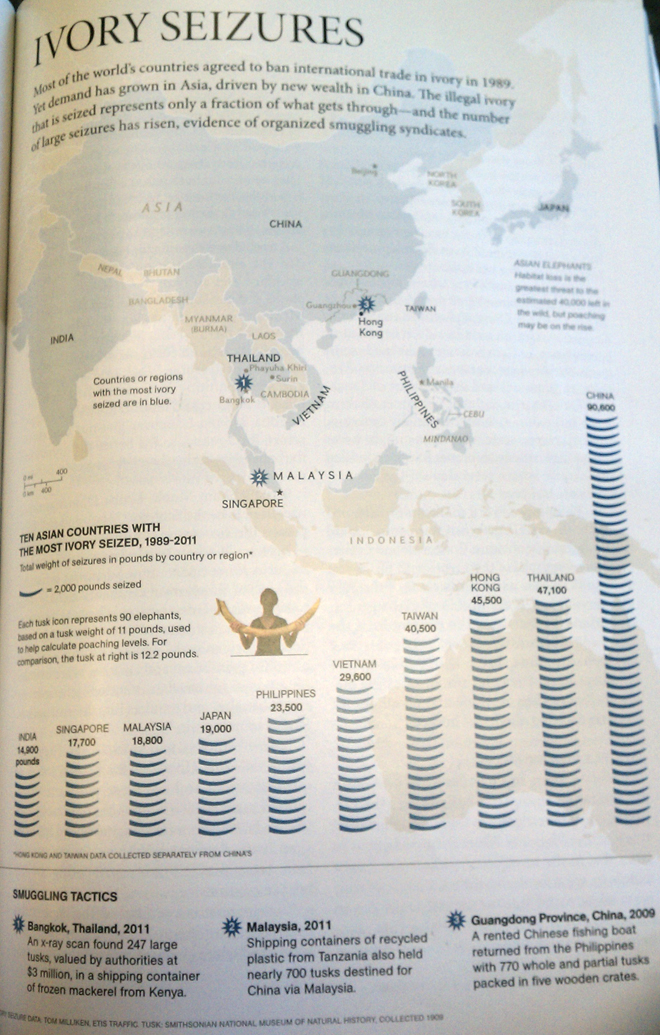
I’m back after two weeks holiday. See, I didn’t forget you. I even brought you presents. Of a sort. From National Geographic come two maps from an article about the poaching of elephants—if I recall correctly.
The first map is the better of the two. It shows the impact of poaching by overlaying the ranges of the elephants in two different years. Not surprisingly, the range has decreased. The map also points out monitored reserves and then aggregates data from those sites into regions, whose illegal death totals are displayed as little filled-in elephant icons. I don’t love the icons, but they are compact, flat, and stack nicely. Almost squarish. So they can work for me.

This second map is less successful. It dedicates a lot of real estate to a large map that is really only used to highlight countries that are quite large. Without any kind of supplemental data as the first map had, e.g. the elephant ranges, I would have likely made the map smaller. The tusk chart below the map…yeah.

Both taken together, I am left with the impression that the full-page graphics were the work of two different hands. The first map has the level of detail of someone who is conversant in and works regularly on infographics. The second page feels a bit weaker, as if from someone not quite so familiar with infographics and how to make the best of them.
Credit for the pieces go to NGM staff.
Leave a Reply
You must be logged in to post a comment.