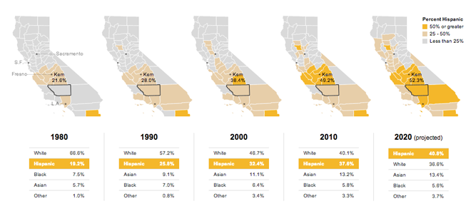
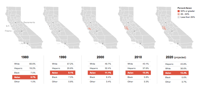
Places never stay the same. And a large part of that is due to demographic shifts. California recently released figures looking at its demographic breakdown through 2060. The New York Times charted and mapped the data through 2020. What the interactive graphic reveals is a stunning shift in just 40 years, less than two generations.
Linking the small multiples through the roll-over allows you to follow the exact change for your county of interest.

Rolling over the demographic group recolours the map to match. While the story is about Hispanic growth, I do wish I could select the group and examine its numbers across California’s counties.

Credit for the piece goes to Mike Bostock, Shan Carter, and Kevin Quealy.
Leave a Reply
You must be logged in to post a comment.