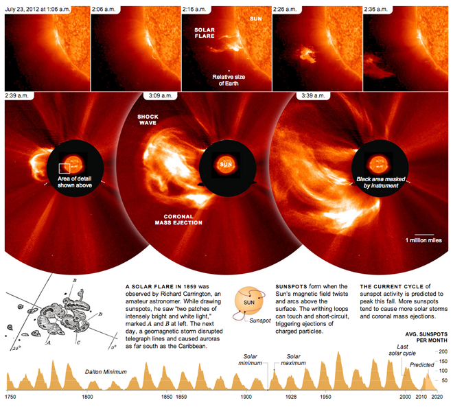
Don’t stare into the sun. It’ll burn your eyes out, kid. Okay, so maybe that’s a stretch of a reference, but, seriously, don’t. Let the professionals do it with (properly shielded) telescopes and such. This piece from the New York Times looks at a solar flare from 2012 and shows how quickly it developed. The bottom of the piece then shows the reader the frequency of solar minimums and maximums along with some explanatory graphics about just what flares and sunspots are and how they are created.
Also note the centre panel in the top row for the relative size of Earth. Yeah, who’s feeling big now? (Not me.)

Credit for the piece goes to Jonathan Corum.
Leave a Reply
You must be logged in to post a comment.