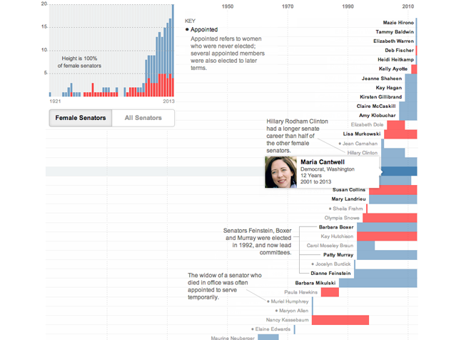
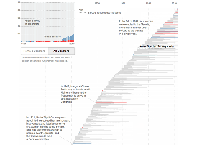
Women are half the population, but only twenty percent of the upper chamber of the United States Congress. As this great interactive timeline from the New York Times shows, at least that inequity has been narrowing over the last several elections.
The infographic comes in two main views. The first highlights women in the Senate and assigns them chronologically and then colours them by party. Important or notable senators are annotated appropriately. This view also shows the breakdown of women in the Senate at any one time in the small chart in the upper-left. Mousing over senators then provides a little bit of information about the woman in question.

But to put it in perspective, by selecting All Senators, the user can see the whole elected history of the US Senate—remember, prior to the 1920s you did not directly elect senators. That makes for a lot of grey bars, i.e. a lot of men.

Credit for the piece goes to Hannah Fairfield, Alan McLean and Derek Willis.
Leave a Reply
You must be logged in to post a comment.