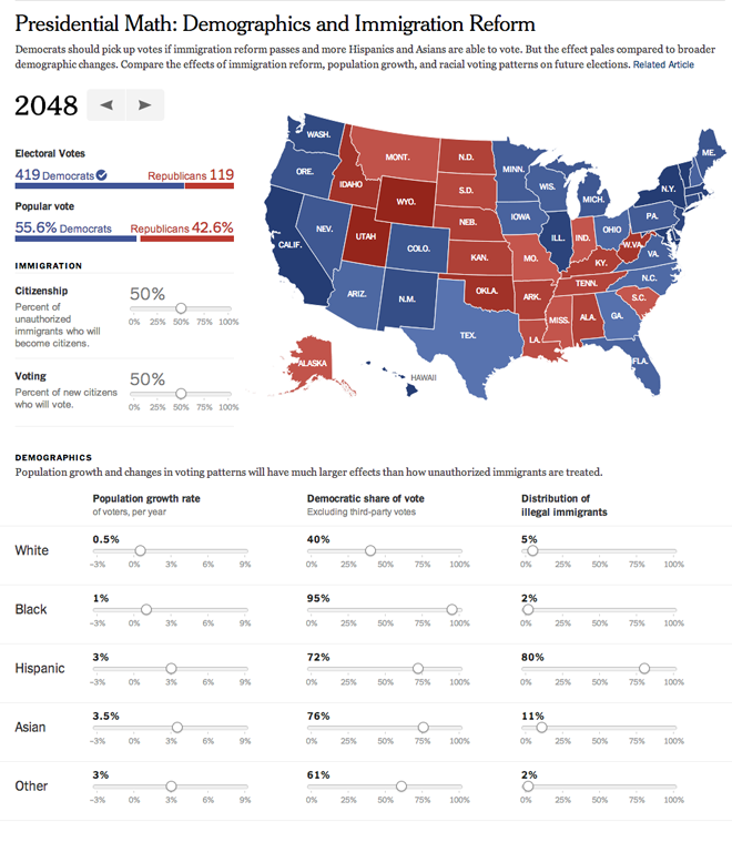
Of 2048. Well, kind of. Lately the country has been talking a lot about immigration and its impacts because of this bipartisan desire to achieve some kind of result on an immigration bill working its way through the Senate. One of the common thoughts is that if we legalise a whole bunch of illegals or document most of the undocumented (I’ll leave the language for you to decide), the new American citizens will overwhelmingly vote Democratic and there goes the Republic(an Party).
Nate Silver—yes, that Nate Silver who accurately predicted the presidential results and a whole bunch of other stuff too—looked at a more complex and more nuanced set of demographic variables and found that the aforementioned argument greatly oversimplifies the results. The problem is not entirely the entry of newly documented or illegal workers. Instead, there are systemic demographic issues.
So here comes the New York Times with an excellent data explorer and forecast modeller. You can set the year to examine and then set the results of the immigration debate with how many immigrants are made legal/documented and then how many of them vote. After that you can begin to adjust population growth, voting patterns, &c. to see how those affect the elections. (The obvious caveats of acts of god, party platforms, candidates, &c. all hold.)

The fascinating bit is that if you keep the demographic patterns as they are currently, adjusting the immigration factors at the outset have very little impact on the results. The country is moving towards the current Democratic platform. Even if 0% of the undocumented/illegal immigrants become documented/legal, and if 0% of 0% vote, the result is still a landslide for the Democrats. The real changes begin to happen if you adjust the population growth rates of the legal/documented citizens and voters. But those patterns/behaviours are a lot more difficult to adjust since you can’t legislate people to have more babies.
All in all a fascinating piece from the New York Times. The controls are fairly intuitive, drag sliders to adjust percentages. The sliders have clear labels. And the results on the map are instantaneous. Perhaps the only quirk is that the ranges of the colours are not detailed. But that might be a function of forecasting the data so far into the future and having growing ranges of certainty.
Credit for the piece goes to Matthew Bloch, Josh Keller, and Nate Silver.
Leave a Reply
You must be logged in to post a comment.