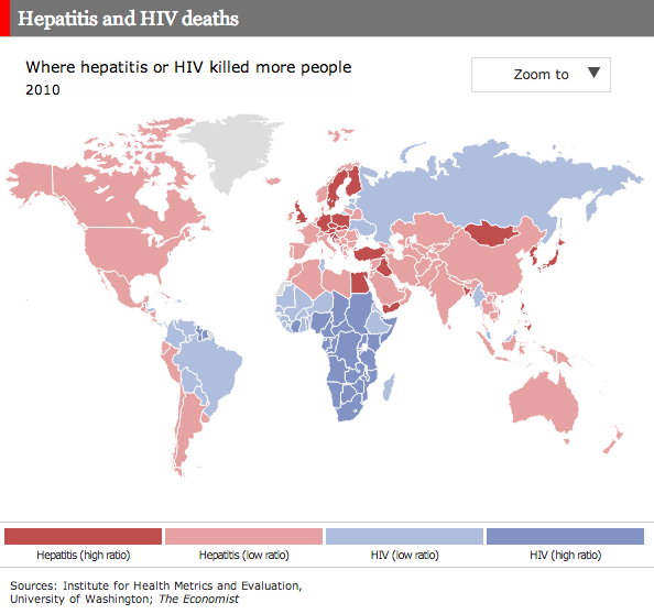
I don’t often write about maps, especially of the choropleth kind. In many cases I choose not to because so many of the maps are one-dimensional: how fast is x growing across the world; which is predominant across the world, y or z? So I was pleasantly surprised by the Economist yesterday when they published this interactive map on the scourges of hepatitis and HIV.

Quickly put, the map is a success. It shows a clear geographic pattern; the developed/Western world along with the Middle East and Asia have a larger problem in hepatitis than HIV whereas Africa and Latin America are dealing moreso with HIV. (Admittedly, the fact that 117 out of 187 countries are dealing more with hepatitis is lost because so many of the countries are small in area.) But, the really nice bit about the map is not just the colour by virus, but the tint by comparative ratio. The darker the colour, the stronger the one virus over the other.
Lastly, from a data perspective, I just wonder if the ratios could not be adjusted for population, or deaths as a percentage of the national population? I would be curious to see if that would yield interesting results.
Credit for the piece goes to C.H., R.L.W., J.S., and D.H.
Leave a Reply
You must be logged in to post a comment.