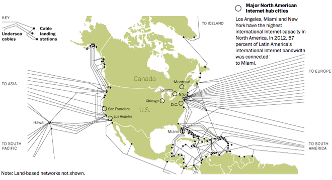
Recently the Washington Post published an infographic that explored the cable network that connects the different continents and brings to each the internet. In short, where North America once dominated as an international hub it now is on the decline.

The piece tells an interesting story supported by good data that is clearly presented. Clear and informative titles prompt the reader along the piece while good chart forms show just what is happening to internet bandwidth and continental differences. And from a design perspective, this is all done with what appears to be two colours: a dark green and its shades/tints, and black. Overall, a solid piece.
Credit for the piece goes to Todd Lindeman.
Leave a Reply
You must be logged in to post a comment.