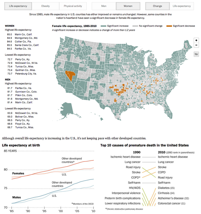
Earlier this summer I looked at a graphic by Thomson Reuters that compared life expectancy changes across the world from 1990 to 2011. Last month, the Washington Post published an interactive graphic that explores life expectancy (along with obesity and physical activity) across the United States from 1985 to 2010.

What I really enjoy about the piece is that each toggle for the health condition, i.e. life expectancy, obesity, physical activity, the text beneath swaps out to explain what the story is. Context is key. But then the ability to flip between the actuals and the growth for both men and women allows the user to really explore the data. And to see that growth or lack thereof is not even across the sexes.
From the design side, a minor point worth noting is the use of different colour palettes based on the mapped metric. The actual values (with the greater range) use a darker green-blue and tint that down whereas the growth values (all of three conditions) are in a different palette. Here it works, though I am more accustomed in similar pieces to seeing the swapping of palettes for changes in the mapped metric.
Beneath the big map, however, are two components also well worth the user’s attention. Perhaps deceptively simple, two sets of line charts, they add (again) context to the data. For example, while it is great to see life expectancy in the United States improving, when you compare that to the rest of the developed world, we are falling behind.
Overall a solid piece.
Credit for the piece goes to Patterson Clark, Kennedy Elliott, and Katie Park.
Leave a Reply
You must be logged in to post a comment.