Last night I watched the caucuses from my dinner table via the internets. And I used this handy piece from the Washington Post. The screenshot is from early in the evening before most of the results had arrived.
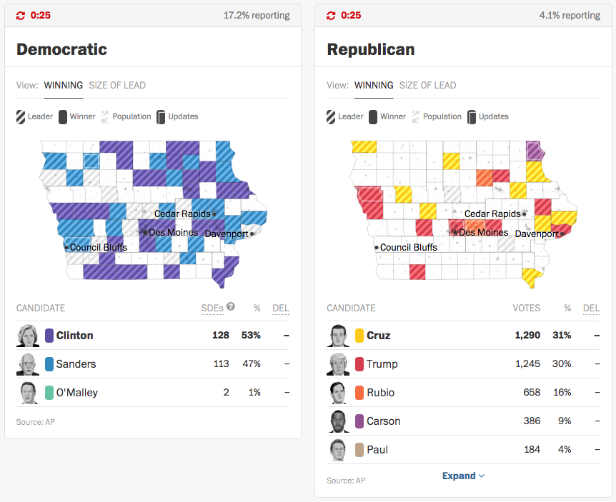
What is really nice is that the site refreshed every thirty seconds. Sometimes nothing happens in a county. But if something did, they used a nice white line within the county borders to indicate a county within which an update had occurred.
Credit for the piece goes to the Washington Post graphics department.
Author: Brendan Barry
I am a graphic designer who focuses on information design. My day job? Well, they asked me not to say. But to be clear, this blog is my something I do on my own time and does not represent the views of…my employers. I think what I can say is that given my interest in information design—be it in the shape of clear charts, maps, diagrams, or wayfinding systems—I am fortunate that my day job focuses on data visualisation. Outside of work, I try to stay busy with personal design work. Away from the world of design, I have become an amateur genealogist and family historian. You will sometimes see that area of work bleed into my posts.
View all posts by Brendan Barry