The Shrinking Extent of ISIS

Yes, ISIS does receive a lot of attention in the media and during the presidential debates. But you might be surprised to learn that actually the organisation has lost a significant amount of territory lately. This BBC article details the territorial changes through a nice interactive map slider.

Use the scroller to see the changes over time

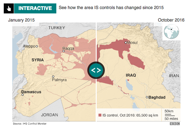
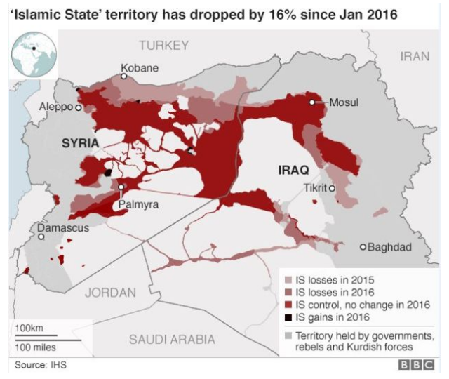
You could create a single map showing the losses/gains instead of using this light-duty interactive piece. And to the BBC’s credit they did. However, between the image quality and territorial changes, I think in this instance the interactive piece does add clarity to the story.

All in one map
All in one map

Credit for the piece goes to the BBC graphics department.

Author: Brendan Barry

I am a graphic designer who focuses on information design. My day job? Well, they asked me not to say. But to be clear, this blog is my something I do on my own time and does not represent the views of…my employers. I think what I can say is that given my interest in information design—be it in the shape of clear charts, maps, diagrams, or wayfinding systems—I am fortunate that my day job focuses on data visualisation. Outside of work, I try to stay busy with personal design work. Away from the world of design, I have become an amateur genealogist and family historian. You will sometimes see that area of work bleed into my posts.

Leave a Reply