Well, so about that whole Michael Flynn furore thing I wrote about yesterday…. Time to add another name to the list of people to be appointed—as I said, that post isn’t confirmed, merely appointed.
But today is Valentine’s Day. So for all you lovebirds out there, here are some graphics showing how rate of marriages has declined in the United States.
It does a real nice job of presenting the overall national view, but then breaking that down into a state-by-state comparison over time, the small multiples shown below.
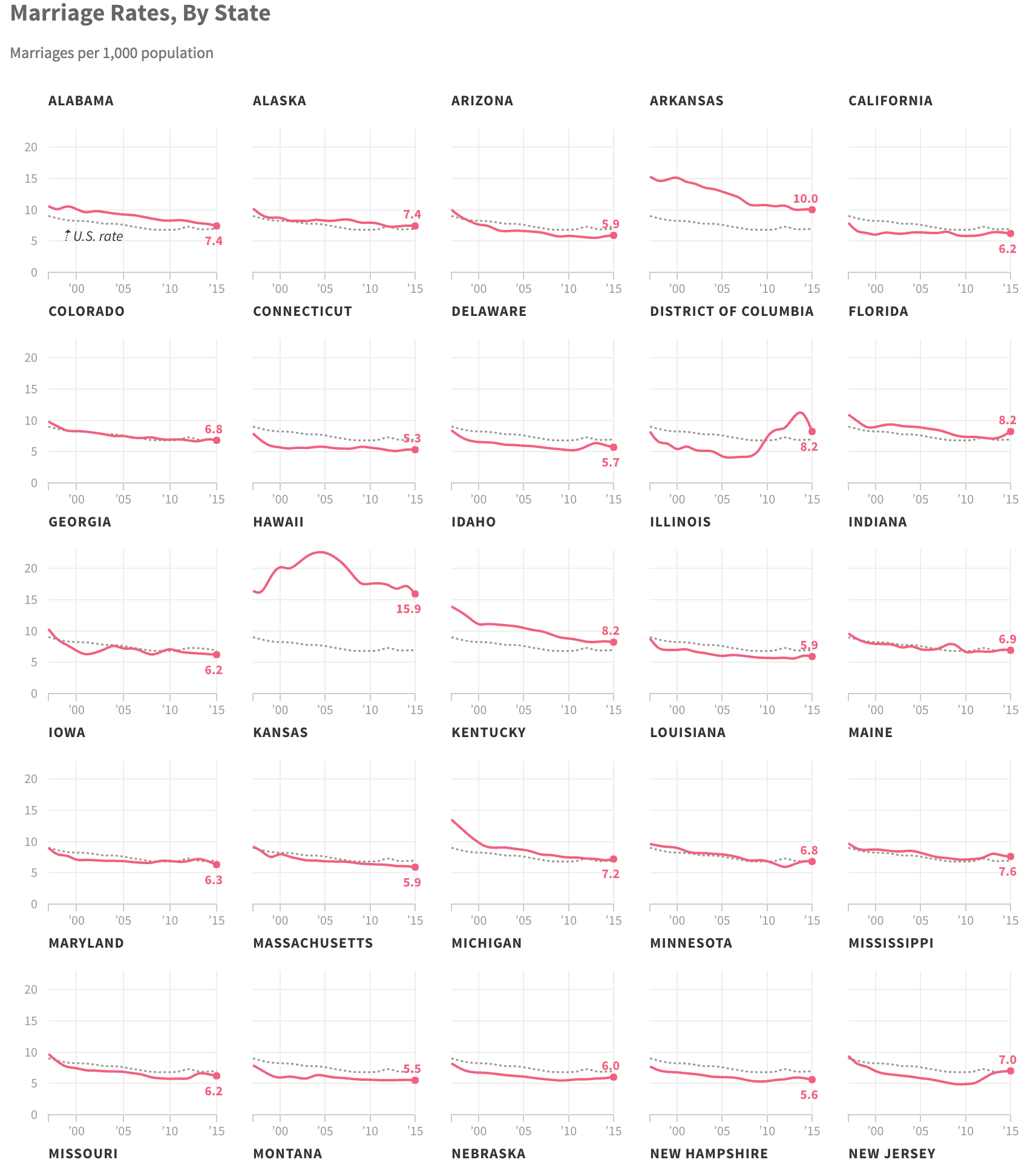
My critique would be the labelling. Note how the state label appears above the chart, but how when stacked in a row, the label for the state below appears far closer to the chart above. The first few times I looked at this, I saw the label for the chart as being below. And I was therefore curious why Kansas was so different from the rest of the plains state. It just goes to show you how important spacing and layout can be on the page.
Credit for the piece goes to Matt Stiles.
Leave a Reply
You must be logged in to post a comment.