Sorry about last week, everyone. I had some trouble with the database powering the blog here. Great week for things to go down, right? Well, either way, we’re back and it’s not like the news is stopping. This week? Brexit’s back, baby.
I’m never using the word “baby” again on this blog.
I have been saving this piece until the announcement of Article 50 by the UK government. I know the British and Europeans among my audience likely know what that means, but for the rest of you, Article 50 is the formal mechanism by which the United Kingdom starts the two-year process to leave the European Union.
Think of it like signing the divorce papers, except that the divorce isn’t unofficial for two years until after that date. The interim period is figuring out who gets which automobile, the dinnerware, and that ratty-old sofa in the basement. Except that instead of between two people, this divorce is more like a divorce between polygamists with multiples husbands and wives. So yeah, not really like a divorce at all.
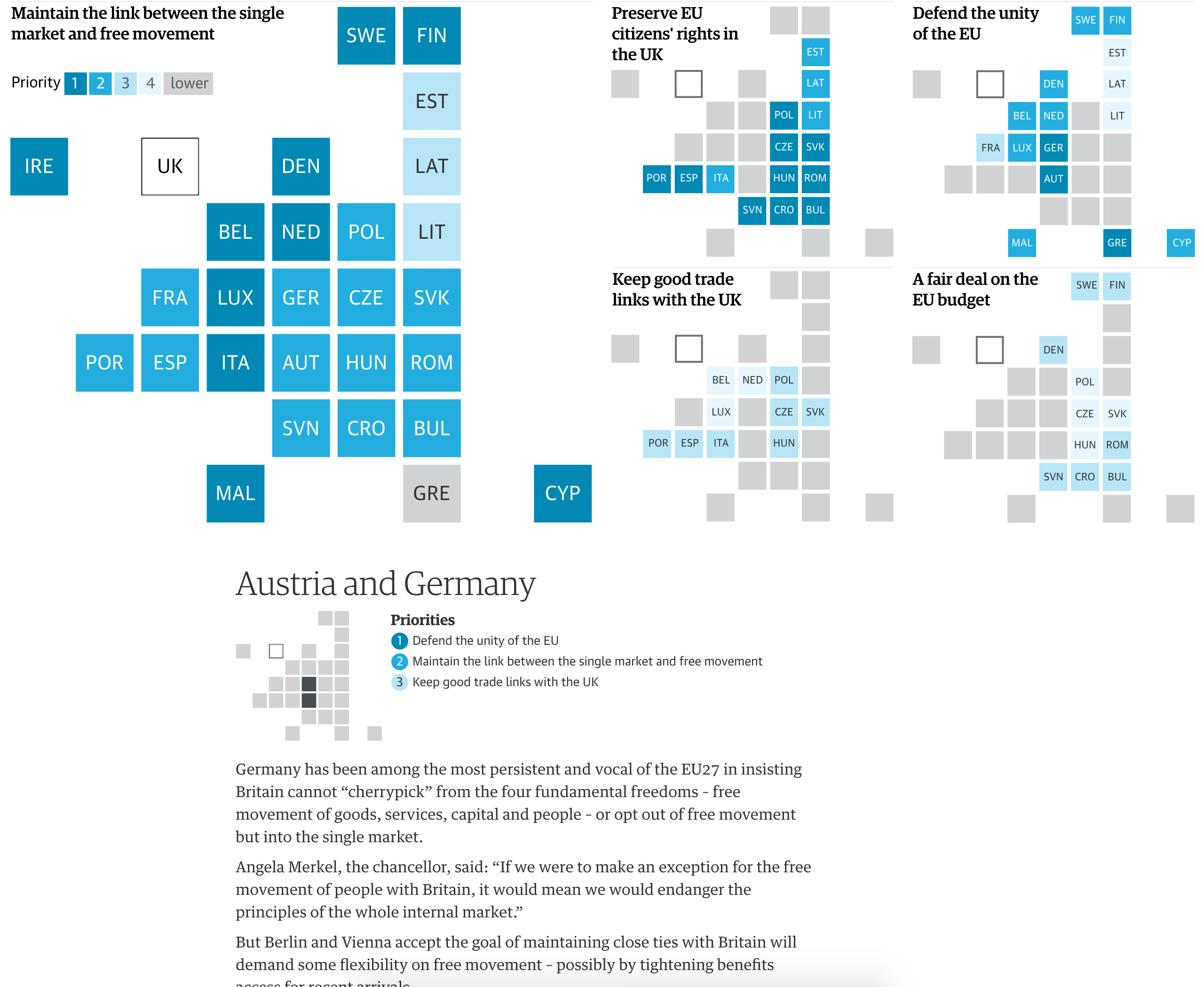
This piece from the Guardian attempts to explain what the various parties want from the United Kingdom and from the eventual settlement between the UK and the EU. It leads off with a nice graphic about the importance of a few key issues in a cartogram. And then several voting blocs run down the remainder of the page with their key issues.
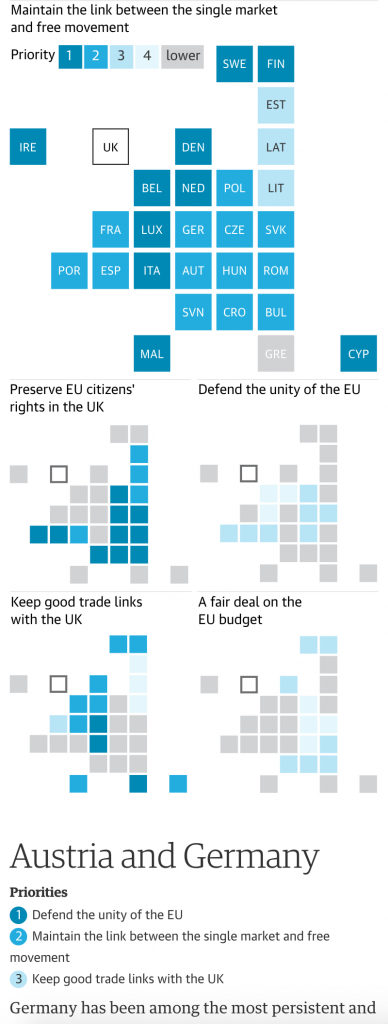
I really like this piece as the small multiples for each section refer back to the opening graphic. But then on a narrow window, e.g. your mobile phone, the small multiples drop off, because really, the location of the few countries mentioned on a cartogram is not terribly important to that part of the analysis. It shows some great understanding of content prioritisation within an article. In a super ideal world, the opener graphic would be interactive so the user could tap the various squares and see the priorities immediately.
But overall, a very solid piece from the Guardian.
Credit for the piece goes to the Guardian’s graphics department.
Leave a Reply
You must be logged in to post a comment.