First, great song by R.E.M.
Second, you may recall a post last week where I shared some work by FiveThirtyEight about life expectancy. In particular I liked the set of small multiples. However, the New York Times just took what I liked and upped it a slight notch.
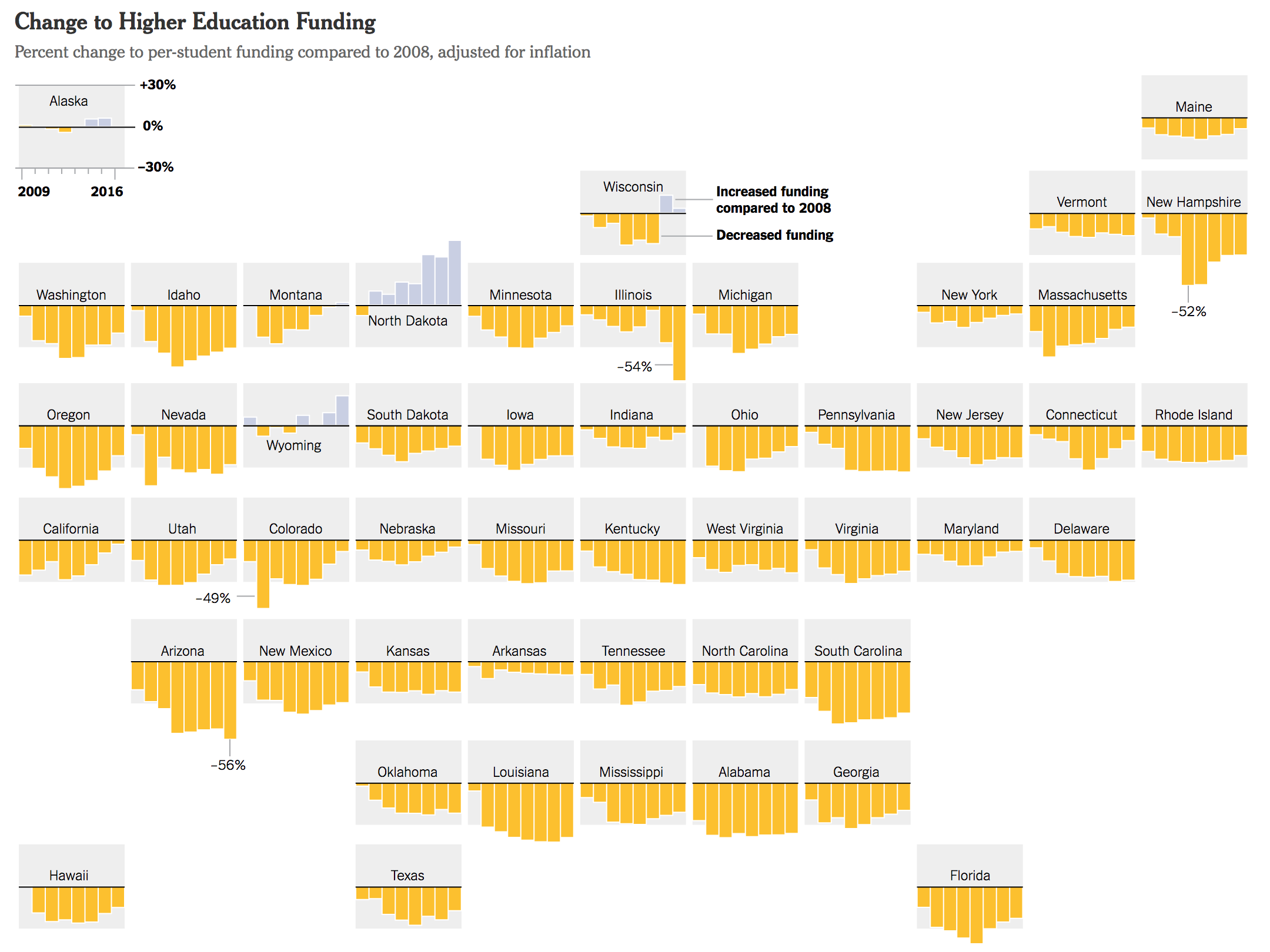
Every small multiple set needs a legend to explain just what the user is looking at. What the Times did is integrate that legend into the Alaska multiple. And it can do that because of Alaska’s position in the upper-left, or northwest, portion of the “map” as a non-contiguous part of the United States.
Clever.
Credit for the piece goes to the New York Times graphics department.
Leave a Reply
You must be logged in to post a comment.