Well there was a lot to poke and prod at in last night’s State of the Union. So over the next couple of days I will be looking at some of the data. I wanted to start with something I could look at over breakfast—unemployment rate data.
President Trump claimed unemployment rates are at the lowest rate in…I forget how many years he claimed. But in a while. And he is correct. But, as this chart shows, he entered office with unemployment rates very near those record lows. A few tenths of a percentage point lower and voila, all-time low. What the data shows is that the bulk of the fall in the unemployment rate actually came under the watch of the Obama administration. The rate peaked at the end of the Great Recession at 10% before falling all the way down to 4.8%, which is about the natural unemployment rate that is somewhere between 4.5% and 5%, what you would expect in a healthy economy.
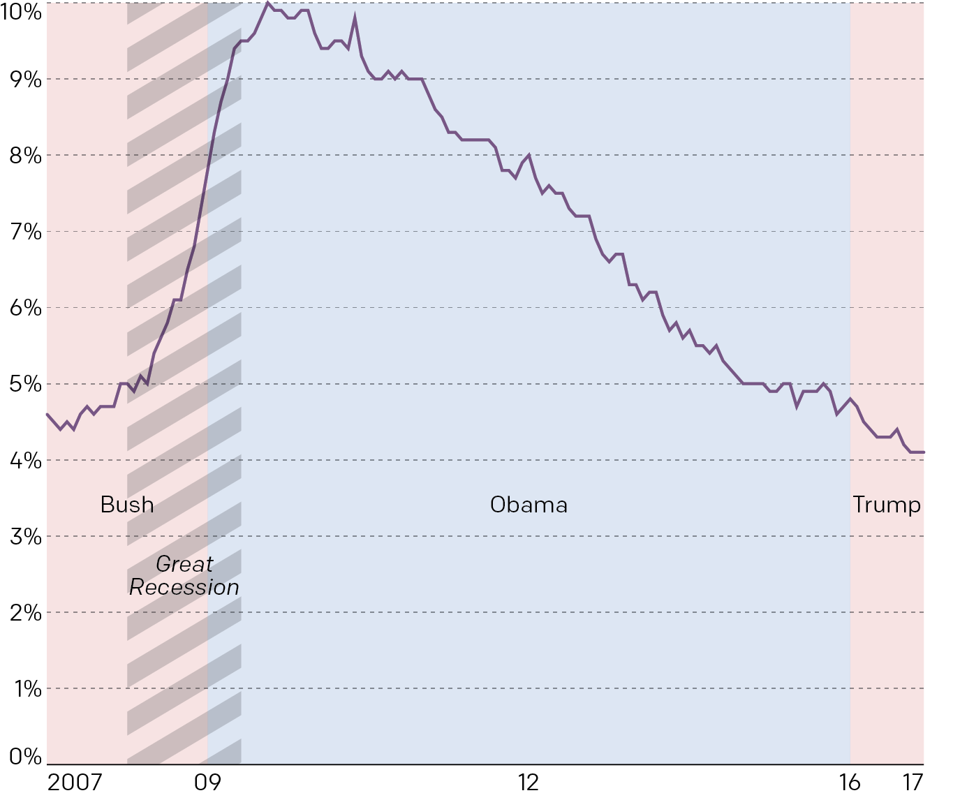
Data is from the Bureau of Labour Statistics, chart is mine.
Leave a Reply
You must be logged in to post a comment.