A few days ago I posted about the front cover graphic for the New York Times that used a choropleth to explore 2017 economic growth. Well, this morning whilst looking for something else, I came across the online version of the story. And I thought it would be neat to compare the two.
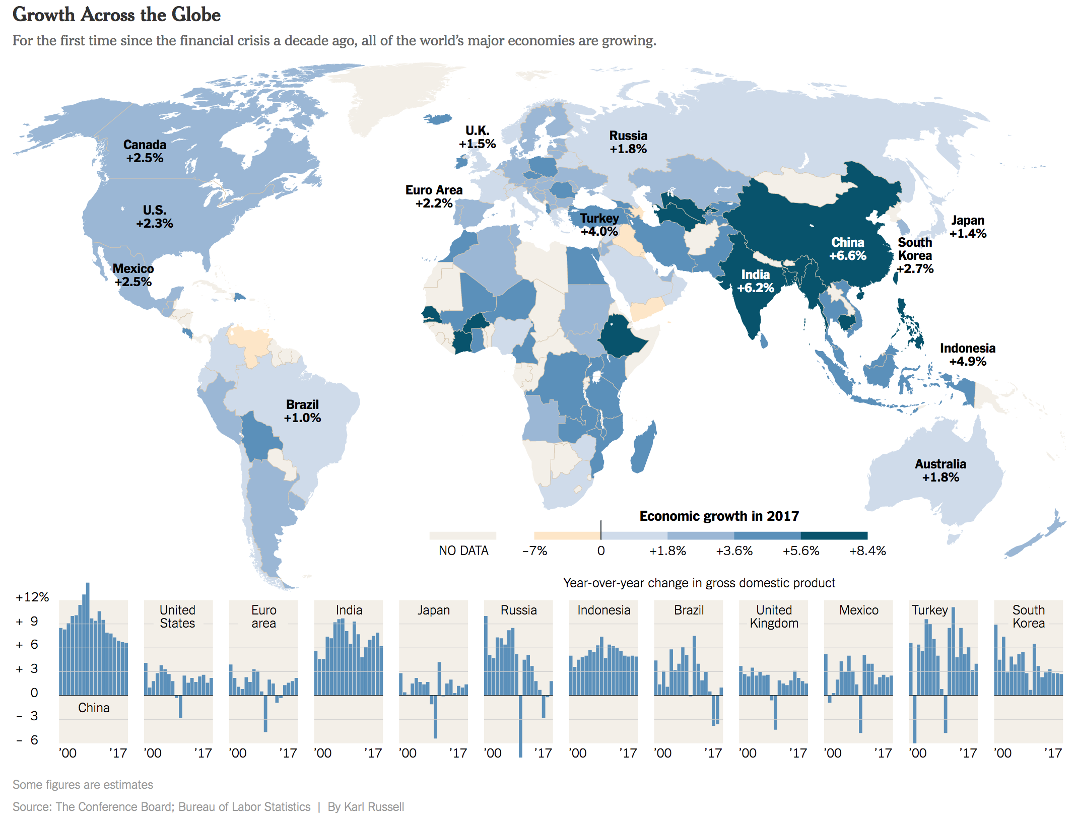
Again, nothing too crazy going on here. But the most immediately obvious change is the colour palette. Instead of using that green set, here we get a deep, rich blue that fades to light very nicely. More importantly, that light tan or beige colour contrasts far better against the blue than the green in the print version.
The other big change is to the small multiple set at the bottom. Here they have the space to run all twelve datasets horizontally. In the earlier piece, they were stacked six by two. It worked really well, but this works better. Here it is far easier to compare the height of each bar to the height of bars for other countries.
Credit for the piece goes to Karl Russell.
Leave a Reply
You must be logged in to post a comment.