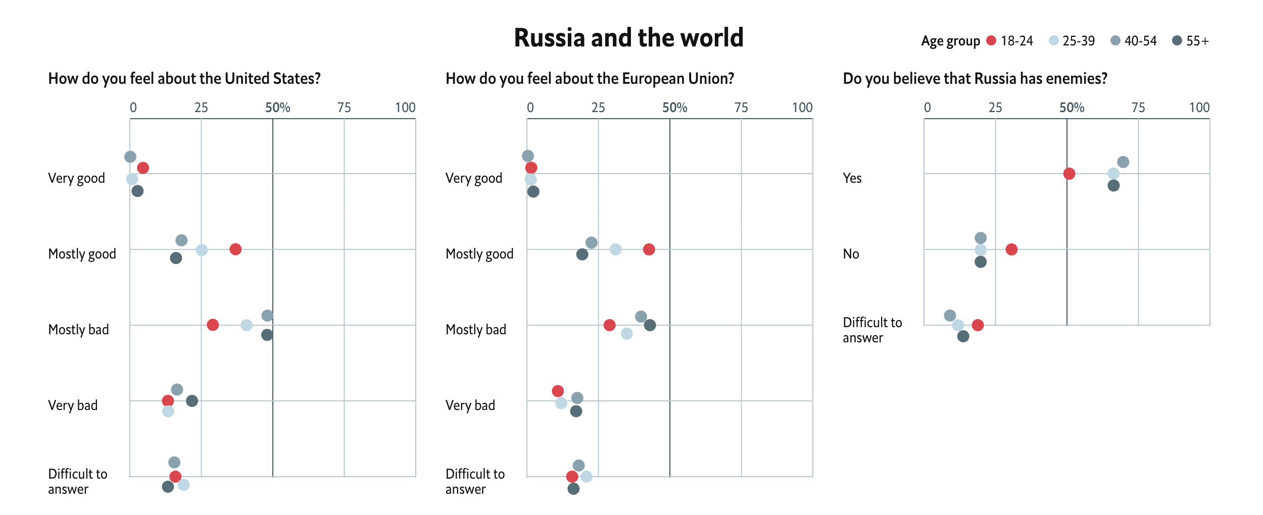
In news that surprises absolutely nobody, Russia “re-elected” Vladimir Putin as president for another six-year term. The Economist recently looked at what they termed the Puteens, a generation of Russians born starting in 1999 who have no memory of a Russia pre-Vladimir Putin.
This piece features a set of interactive dot plots that capture survey results on a number of topics that are segmented by age. It attempts to capture the perspective of Puteens on a range of issues from their media diet to foreign policy outlook to civil rights.

The design is largely effective. The Puteen generation sticks out clearly as the bright red to the cool greys. And more importantly, when the dots would overlap they move vertically away from the line so users can clearly see all the dots. And on hover, all the dots of the same age cohort’s interest are highlighted. I think one area of improvement would have been to apply that same logic to the legend to allow the user to scroll through the whole dataset without always having to interact with the chart. But that is a minor bit on an otherwise really nice piece.
Credit for the piece goes to the Economist’s graphics department.
Leave a Reply
You must be logged in to post a comment.