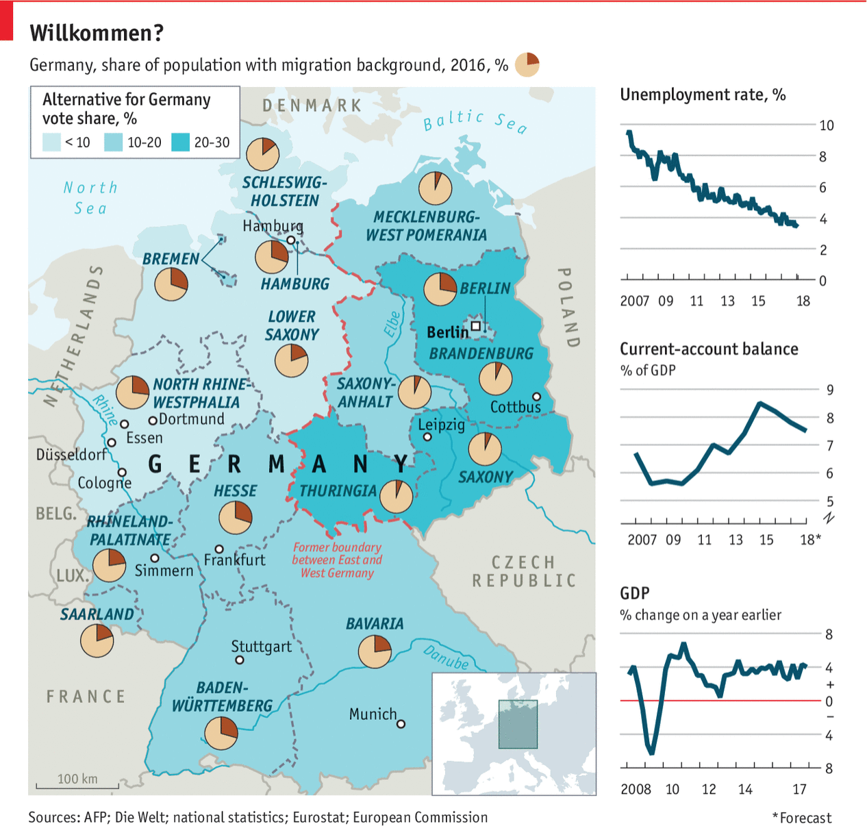
Last week Angela Merkel, the German chancellor, visited President Trump in Washington. This post comes from the Economist and, while not specifically about that trip, describes Germany in a few different metrics. Back in the day it would be what I called a country-specific datagraphic. That is, it shows metrics not necessarily connected to each other, but all centred around a country. In theory, the framework can then be used to examine a number of different countries.

That sort of works here, except the choropleth is for the Alternative for Germany political party. That only real works as a metric in, you know, Germany.
Overall, I like the piece. The layout works well, but Germany is fortunate in that the geographic shape works here. Try it with Russia and good luck.
First let us dispense with the easy criticism: do we need the box map in the lower right corner to show where in the world Germany is? For Americans, almost certainly yes. But even if you cannot identify where Germany is, I am not certain its location in Europe is terribly important for the data being presented.
But the pie charts. I really wish they had not done that. Despite my well-known hatred of pie charts, they do work in a very few and specific instances. If you want to show a reader 1/4 of something, i.e. a simple fraction, a pie chart works. You could stretch and argue that is the case here: what is the migrant percentage in Bavaria? But the problem is that by having a pie party and throwing pie charts all over the map, the reader will want to compare Bavaria to the Rhineland-Palatinate.
Just try that.
Mentally you have to take out the little red slice from Bavaria and then transpose it to Rhineland-Palatinate. So which slice is larger? Good luck.
Instead, I would have left that little fact out as a separate chart. Basically you need space for 16 lines, presumably ranked, maybe coloured by their location in former East or West Germany, and then set in the graphic. Nudge Germany to the left, and eat up the same portion of Bavaria the box map, cover the Czech Republic, and you can probably fit it.
Or you could place both metrics on a scatter plot and see if there is any correlation. (To the designers’ credit, perhaps they did and found there is none. Although that in and of itself could be a story to tell.)
The point is that I still hate pie charts.
Credit for the piece goes to the Economist’s graphics department.
Leave a Reply
You must be logged in to post a comment.