On Saturday I attended an all-day seminar by the New England Historic Genealogical Society (NEHGS) at the new Museum of the American Revolution here in Philadelphia. Just fantastic. One of the lectures included some maps that looked at the distribution of families over a year span—turns out families did not stand still. Instead, they tended to “fill in” the sparser areas near their settlements and as land became sparser, the younger sons with less to inherit began to move further west, primarily, but also sometimes north into the rest of the nascent United States.
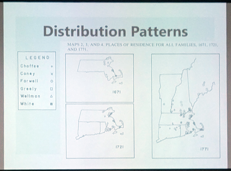
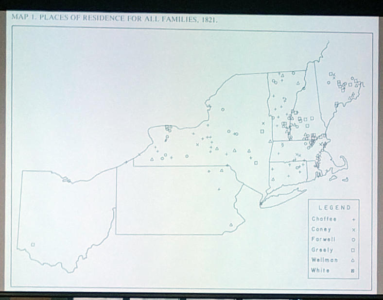
In terms of design, these work in a black and white book, so we do not get any fancy colours. Consequently, the location markers are well chosen as distinct shapes. I also liked the limitation of state outlines to only those states where descendants were present to limit the amount of distracting black lines on the graphic.
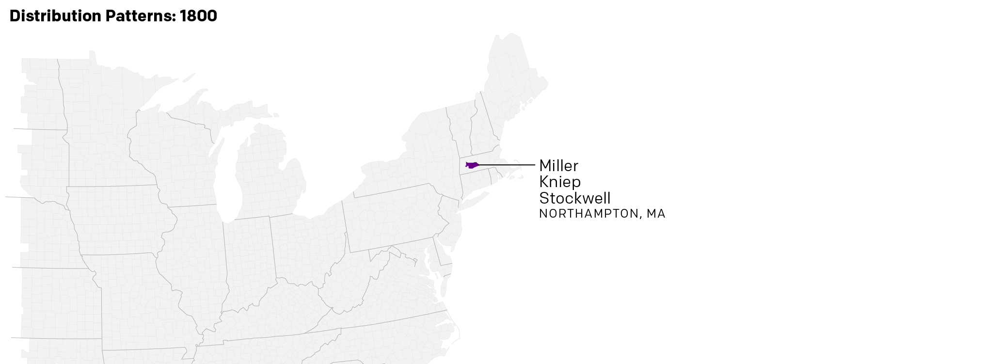
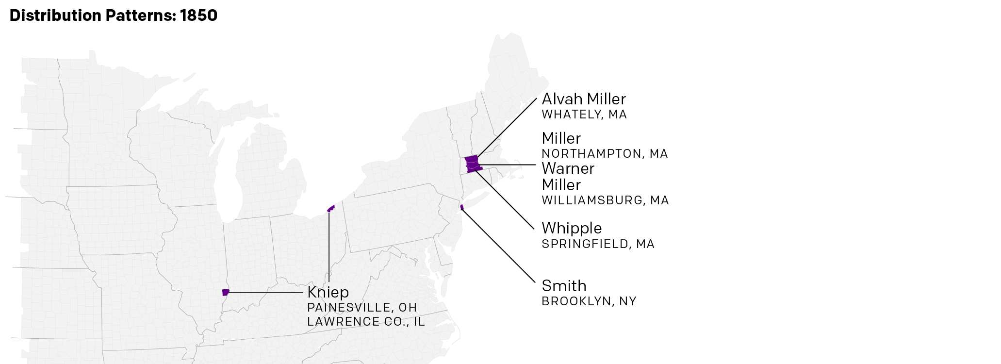
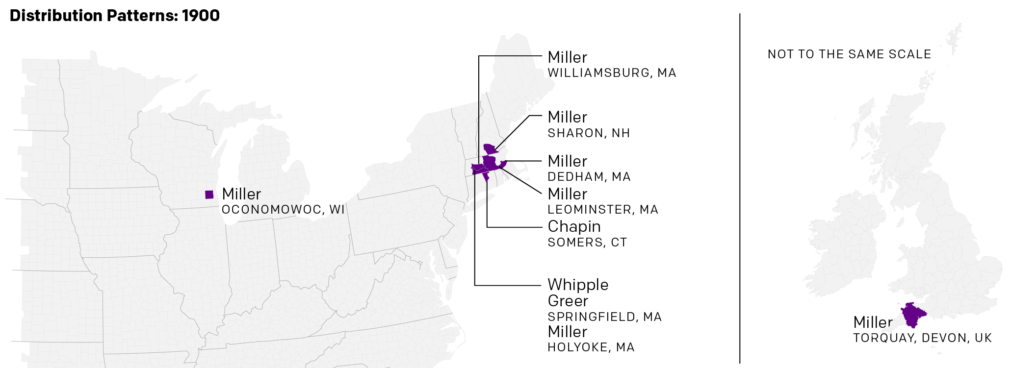
Perhaps not surprisingly I then decided to take my own stab at something similar late last night and this morning. I looked at only one line of ancestors, the Millers, and their descendants with the caveat that there are very much indeed holes in lines of the cousins and second cousins that I have not followed yet. But those I have included show, to a lesser degree, that patterns of movement west and north. The key difference is I extended mine to 1900, because the pattern becomes a little bit clearer over time in my family. I also stopped writing out names of individuals and just started writing out families, because it gets out of control pretty quickly.
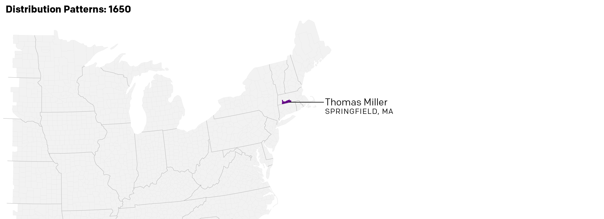

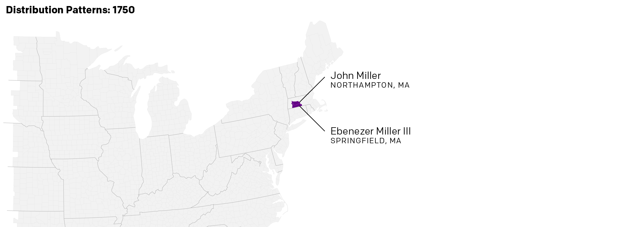
Credit for the originals goes to Lois Kimball Matthews.
Credit for the coloured one is mine and my Miller family ancestors and their descendants.
Leave a Reply
You must be logged in to post a comment.