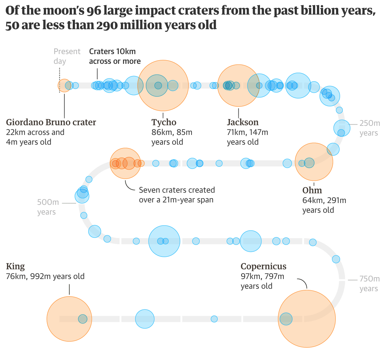
I hope everybody enjoyed their holiday. But, before we dive back into the meatier topics of the news, I wanted to share this serpentine graphic from the Guardian I discovered last week. Functionally it is a timeline charting the size of 96 known large asteroid impact craters on the Moon, between 80ºS and 80ºN.

The biggest question I have is whether the wrapping layout is necessary. I would prefer a more simplistic and straightforward, well, straight timeline, but I can imagine space constraints forcing the graphic into this box—either for the digital version and/or the likely print version.
The transparencies help to give a sense of density to the strikes, especially in the later years. And the orange ones highlight important or well-known craters like Tycho.
I do wonder, however, if the designer could have added a line at the 290 million years point. Since the graphic’s title calls that year out in particular, it might help the audience more quickly grasp the graphic’s…impact. In theory, the reader can more or less figure it out from the highlighting of the Ohm impact crater that is listed as 291 million years old. But a small grey line like those for the 250 million year increments could have been a nice little touch.
Overall, however, it’s nice to see a compact and helpful space graphic.
Credit for the piece goes to the Guardian graphics team.
Leave a Reply
You must be logged in to post a comment.