As someone who loves geography and maps, I have plenty of printed atlases and map books. One year, as a gift, my family gave me an early 20th century atlas. That one in particular is remarkable because of how much the world changed between 1921 and 2019—what was French West Africa is now several independent countries.
But our maps may be changing again as Greece has now formally recognised the Former Yugoslav Republic of Macedonia as North Macedonia, what most of the world simply calls Macedonia. But Greeks do not want you to confuse that Macedonia with the Macedonia (or Macedon) of Ancient Greece and Alexander the Great. The squabble over the name has prevented what will be North Macedonia from joining the European Union and NATO because of Greek objections.
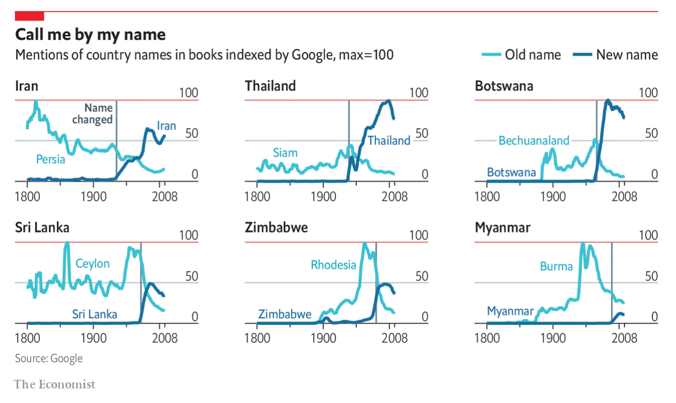
As the Economist recently showed, however, it might take a little while before the name Macedonia catches on with the public at large. (Note, I intended to type North Macedonia but instead went with Macedonia. I opted to leave it incorrect just to show how difficult it will be.)

The plot uses my favourite small multiples to look at six countries whose names have changed. Some of you may be unfamiliar with the originals. Bechuanaland may be the most obscure, but Burma and Ceylon may be far more familiar. Of course the historian in me then wonders why the mentions of countries spiked in books. But small multiples are usually not the place to do detailed annotations to humour an audience of one.
In terms of its design, we have an effective use of colour and line. I may have dropped the thin red line for the max 100 value as it makes the piece a bit busy overall, but that might just be house style.
Of course for this graphic in particular, we will have to wait several years before we can add Macedonia/North Macedonia to the plot.
Credit for the piece goes to the Economist Data Team.
Leave a Reply
You must be logged in to post a comment.