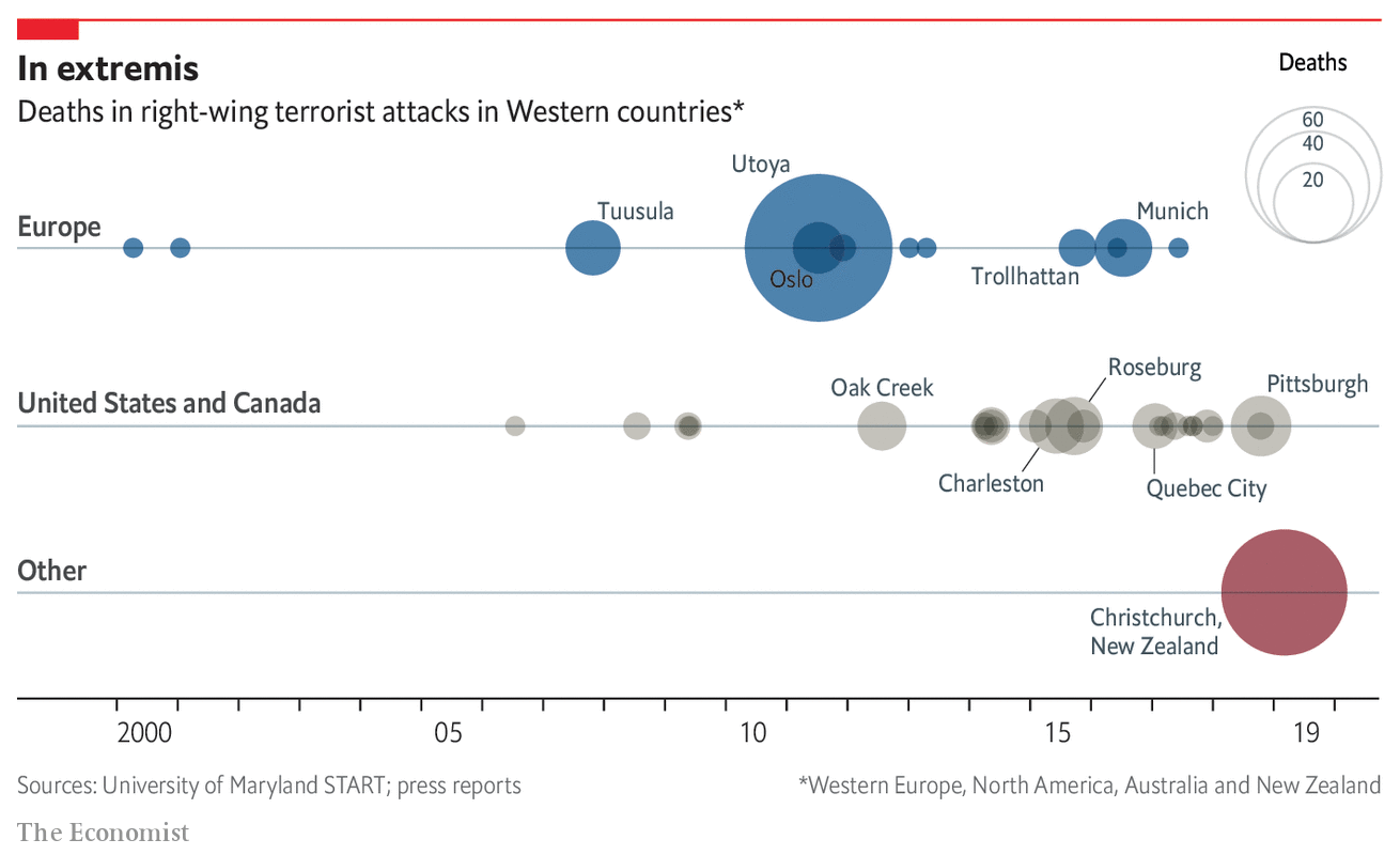
Whilst I was on holiday, a terrorist killed nearly fifty people in Christchurch, New Zealand. Except this time, he was a white man and the victims were all Muslims. Admittedly, I really did not read much about it until I returned to the States, but it clearly is not a thing I was expecting out of New Zealand. But the Economist looked at the question of whether this shooting is more of another in a pattern or a one-off.

The graphic does a fairly good job of showing the increasing frequency of right-wing/white nationalist terror attacks. From a design standpoint, the nice touch is the use of transparency to show overlapping events. For example, the concentric circles for Utoya and Oslo show the two Anders Breivik attacks in Norway.
You could arguably say the treatment begins to fail, however, in the US/Canada timeline. Here, regrettably, there are often too many attacks in too close proximity that the dots are too overlaid. Here I wonder if some other method of stacking or offsetting the incidents could work.
Credit for the piece goes to the Economist data team.
Leave a Reply
You must be logged in to post a comment.