Turns out I was not the only one to look at plotting the ratings of the final series of Game of Thrones. The Economist looked at IMDB ratings, but just prior to the finale on Sunday. They, however, took it a step further and compared Game of Thrones to the final series of other well regarded shows.
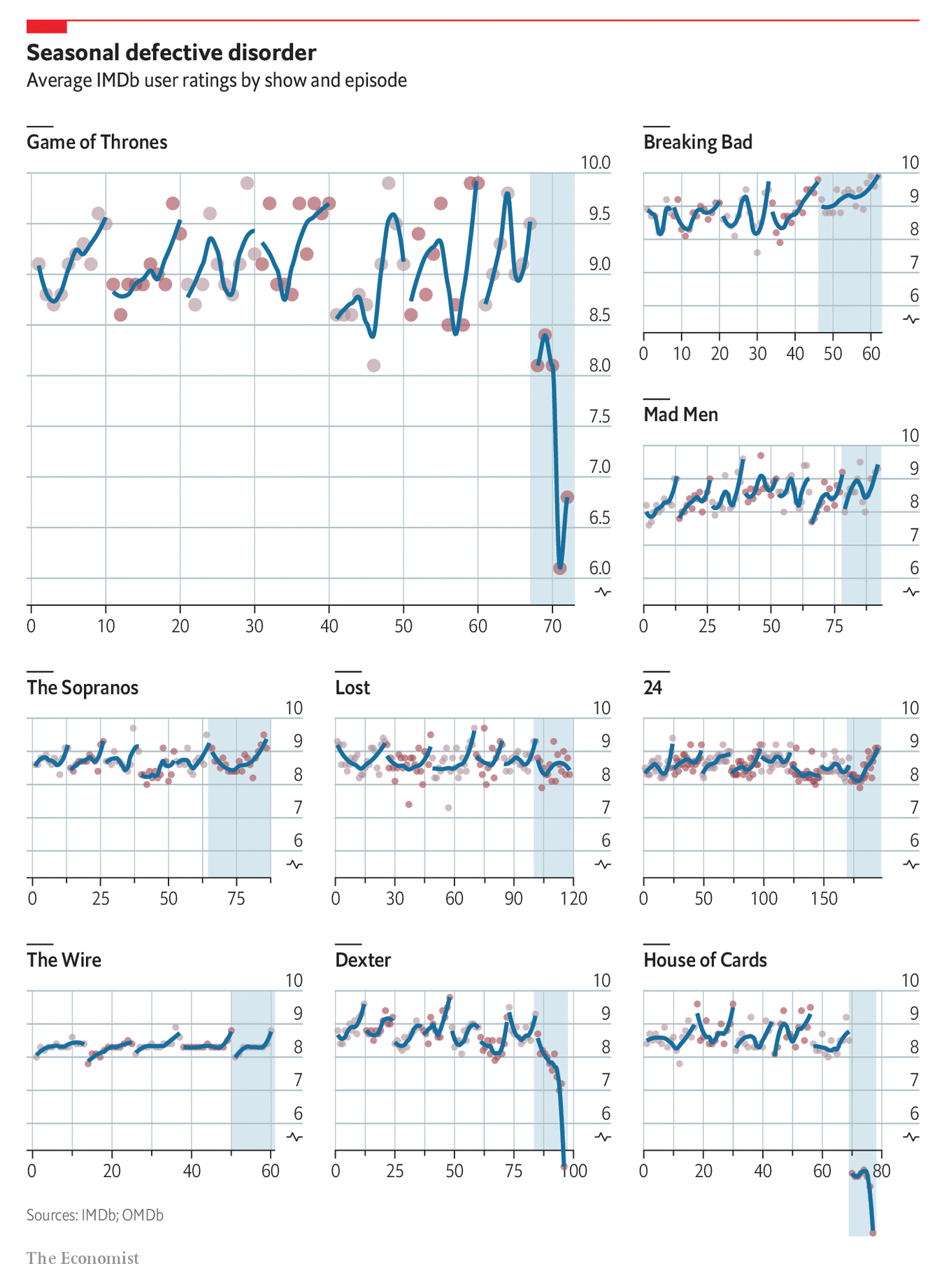
From a design standpoint, I’m not a huge fan of breaking the y-axis at 6. While the data action is all happening at the high range of the scale, that is also the point. Each show is at the top of its class, which makes the precipitous falls of Game of Thrones, Dexter, and House of Cards all the more…wait for it…stark.
I do like the shading behind the line to indicate the final series. That certainly makes it easier to differentiate between the final episodes and those that came before.
But again, I’ll just say, I like how Game of Thrones ended.
Credit for the piece goes to the Economist graphics department.
Leave a Reply
You must be logged in to post a comment.