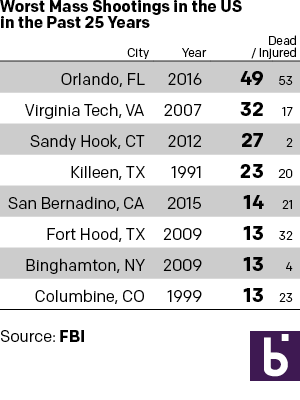
Monday I examined a chart from the BBC that in my mind needlessly added confusing visual components to what could have been a straight table. So here we take a look at some other options that could have been used to tell the same story. The first is the straight forward table approach. Here I emphasised the important number, that of those killed. I opted to de-emphasise the years and the injured in the table. Also, since the bulk of my audience is from the United States, I used the two-letter states codes.
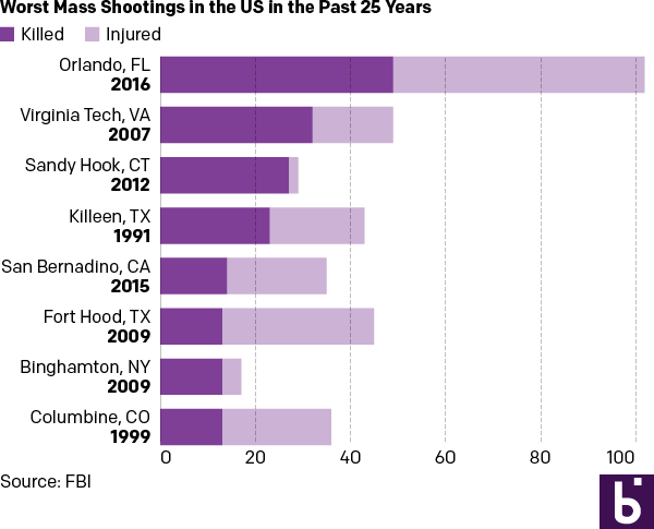
But let us presume we want a graphic because everyone wants everything to be visual and graphic. Here are two different options. The first takes the table/graphic from the BBC and converts it into a straight stacked bar chart, again with emphasis on the dead. I consolidated the list into a single column so one need not split their reading across both the horizontal and vertical.

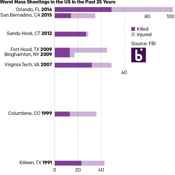
And then if you examine the dates, one can find an interesting component of the data. Of the top-eight shootings, all but two occurred within the last ten years. So the second version takes the graphic component of the stacked bars from the first and places them on a timeline.

For those that wonder about the additional effort needed to create three different options from one data set, I limited myself to an hour’s worth of time. A little bit of thought after examining the data set can save a lot of time when trying to design the data display.
Leave a Reply
You must be logged in to post a comment.