How Bad is the Rohingya Crisis?

Pretty bad.

Less than a week after posting about the satellite views showing entire villages razed to the ground, we have a piece from the Economist looking at refugee outflows. And they are worse than the outflow of refugees during the Rwandan genocide back in 1994.

To be clear, they are not saying that nearly a million people have been killed—though there is quite a bit of evidence to say the Burmese security forces are cleansing the state of Rakhine of one of its primary ethnic groups.
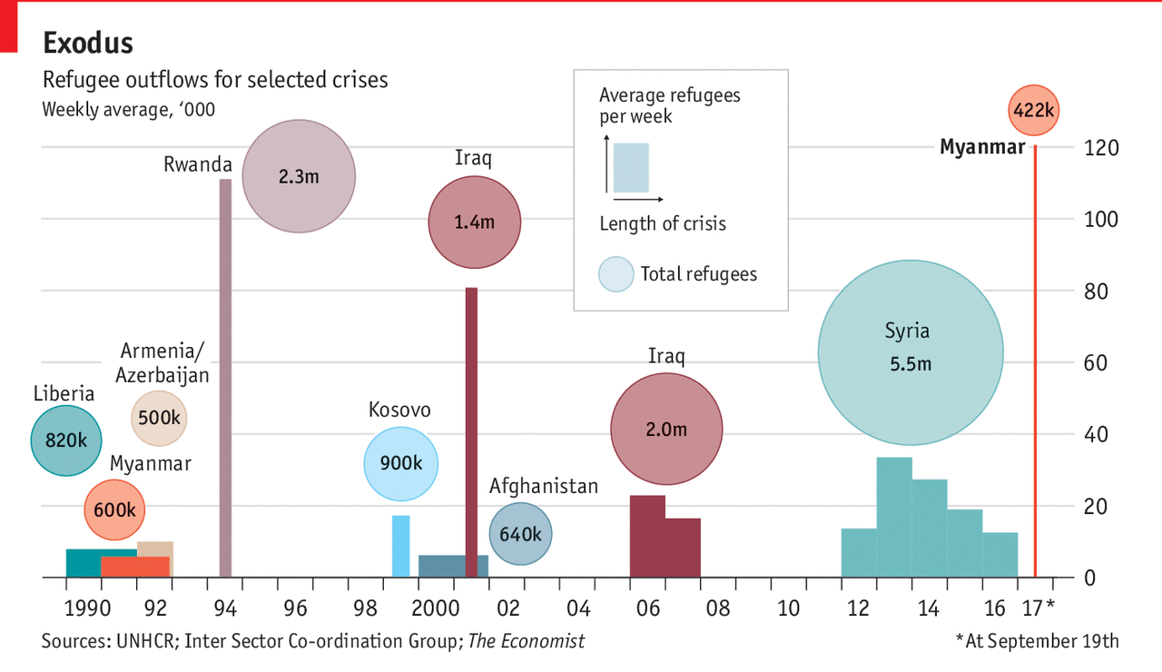
That is a lot of people fleeing Burma

But when it comes to the chart, I am not quite sure what I feel about it. It uses both the x and y axis to show the impact of the refugee outflow. But the problem is that we are generally rubbish at comparing areas. Compounding that, we have the total number of refugees represented by circles, another notorious way of displaying areas. (Often people will confuse the circle’s area with its radius or diameter and get the scale wrong.)

I wonder, would a more straight forward display that broke the dataset into two charts would be clearer? What if the designers had kept the Marimekko-like outflow display, but represented each crisis and its total outflow as a straight bar chart to the right of the timeline? (I do think the timeline is particularly good context, especially since it highlights the earlier persecution of the Rohingya.)

Credit for the piece goes to the Economist’s Data Team.

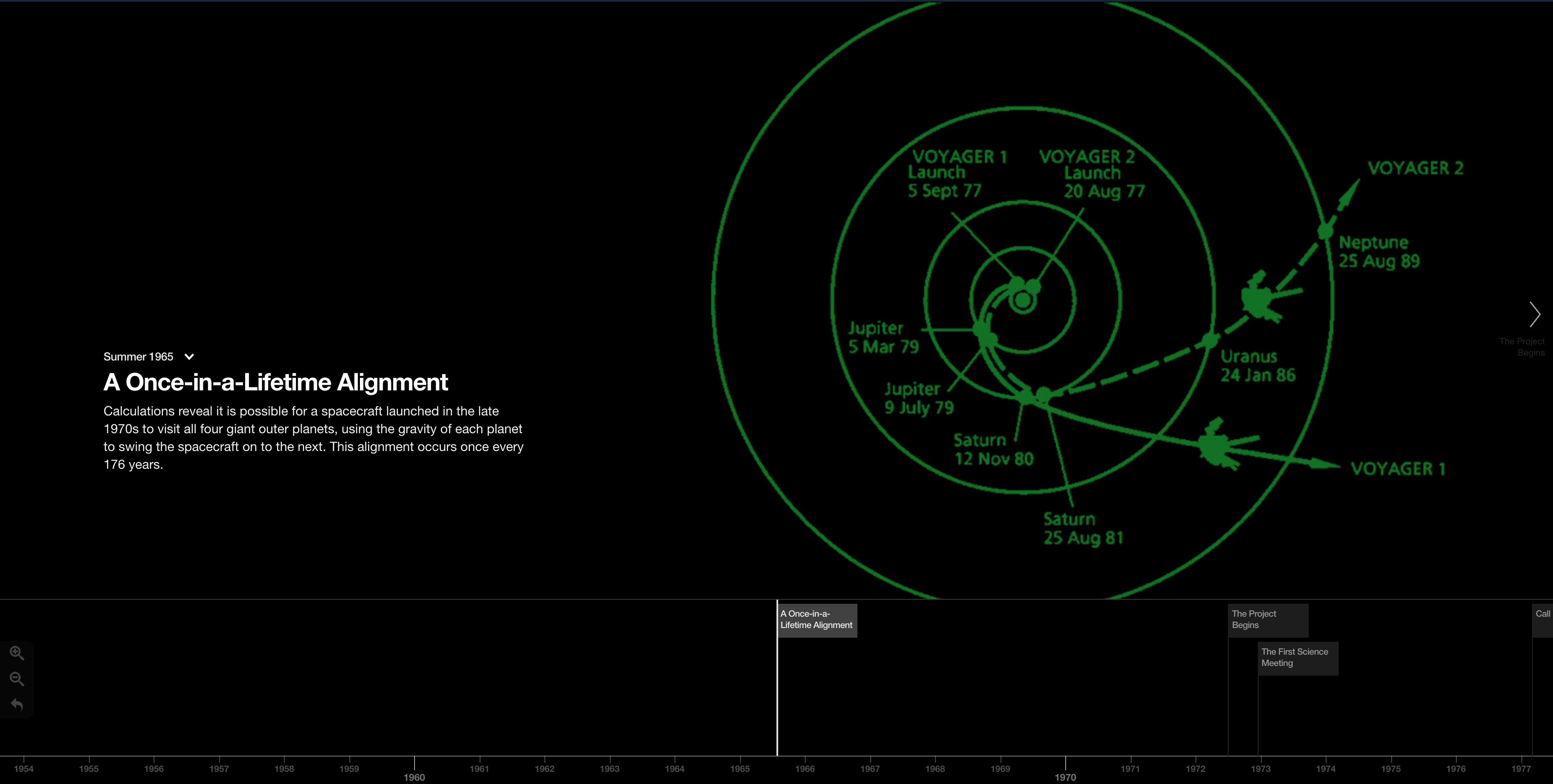
The Timeline of the Voyager Mission

There are a bunch of things to look at this week, but what am I most excited about? Voyager. No, not Star Trek. (Did you know that the Vger entity from the first Star Trek film was a replica of the Voyager probes?) I am of course talking about the Voyager mission to the outer Solar System and beyond.

40 years ago today Voyager 1 lifted off from Cape Canaveral—Voyager 2 left two weeks earlier, but would reach Jupiter and Saturn after Voyager 1, hence being named 2—and it has been collecting images and data for science ever since.

On 25 August 2012, Voyager 1 emerged from the heliosheath and entered interstellar space. In other words, Voyager 1—and sometime in the next few years perhaps—is the first manmade spacecraft to ever leave the Solar System. Mankind is finally out there among the stars.

I love space things.

So JPL and NASA put together this interactive timeline of the mission, which of course continues tomorrow and for years after today until their nuclear fuel runs out.

Boldly going…
Boldly going…

Credit for the piece goes to JPL and NASA.

North Korea’s Missile Programme

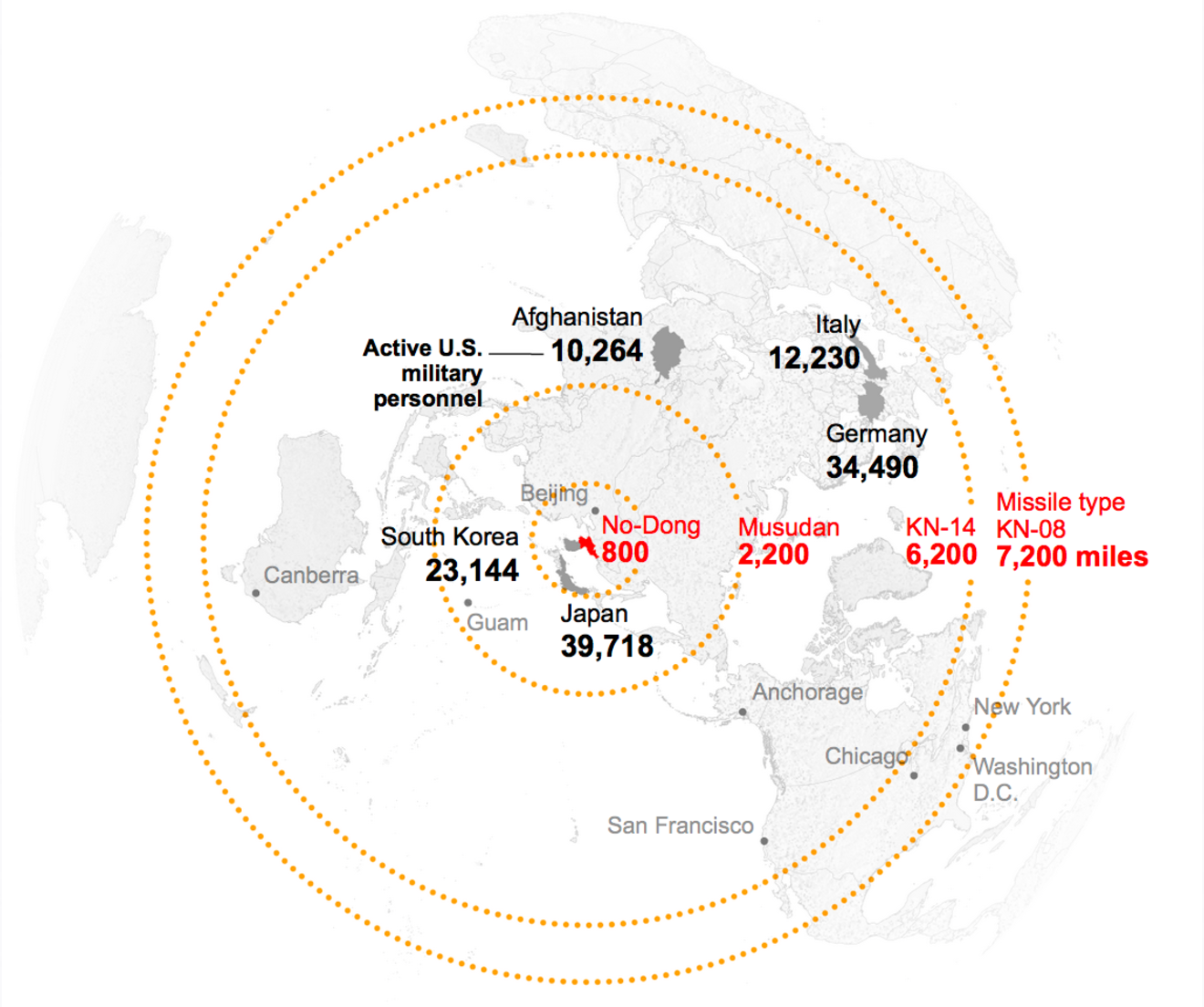
Another week, another batch of news and posturing from North Korea. So I was delighted to see last week a post from Politico exploring the history of the North Korean missile programme with data visualisation.

Shall we play a game?

This kind of maps are my favourite for these types of stories. So often people get locked into this idea of a Mercator or Robinson projection and lines moving right/left or east/west on a map. Instead the world is a globe and the missiles or airplanes or birds or whatever will fly in circles over the poles if it’s easier.

Credit for the piece goes to the Politico graphics department.

Blue Dog Democrats

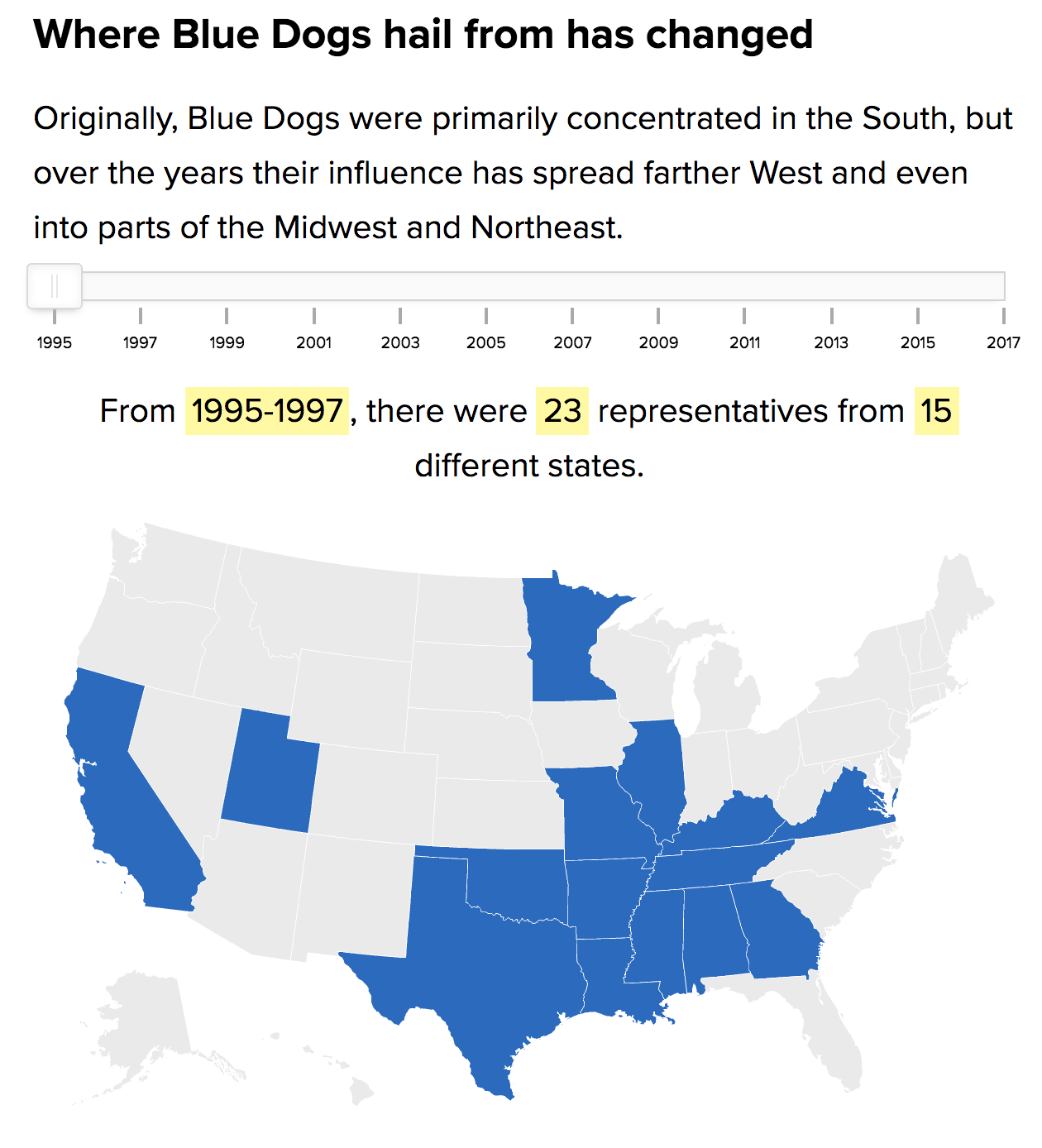
Last week I mentioned that it appeared Politico was running with articles featuring data visualisation. Just this morning I stumbled upon another article, this one about the Blue Dog Democrats. For those that do not know, Blue Dogs are basically a more conservative Democrat and were the remnants of the Democratic south. But in 2010, they got all but wiped out. This article looks at how and where they might just be coming back.

Blue Dogs were largely a faction of the party drawing from the South

If this trend of data-driven and visualised content continues, the Politico could be doing some interesting work over the next year. By then we will be in a rather intense mid-term cycle and there might be some political news to coverage.

Credit for the piece goes to the Politico graphics department.

The Timeline of Leaving the European Union

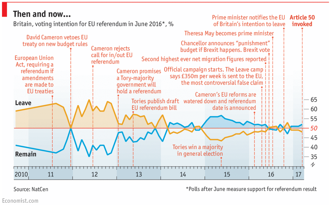
So yesterday was Article 50 Day and several British media companies published graphics about the historic event. I wanted to focus on this piece from the Economist, which is a timeline of the events leading up to Article 50. But more importantly, it includes the polling data for Remain or Leave along the length of those events.

The Brexit campaign timeline

There isn’t a whole lot more to say about this. Article 50 is just kind of a downer.

Credit for the piece goes to the Economist’s graphics department.

Climate Change

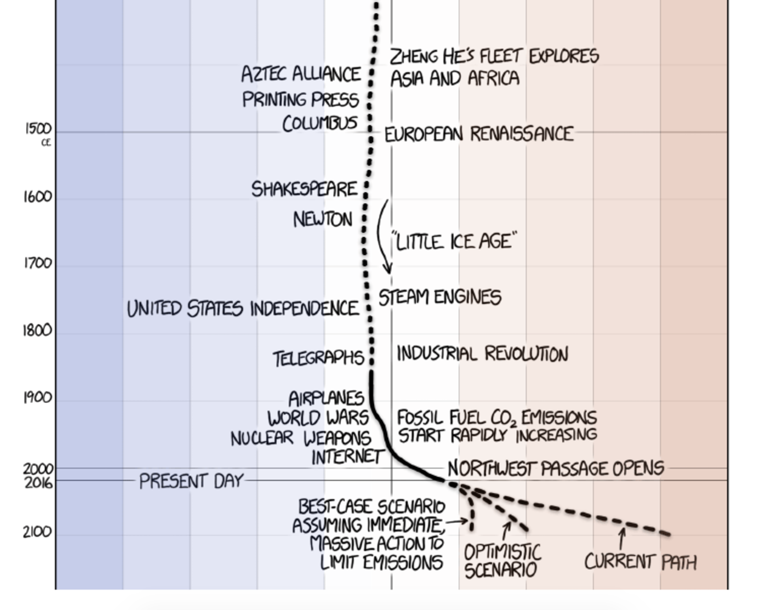
So this is the last Friday before the election next Tuesday. Normally I reserve Fridays for less serious topics. And often xkcd does a great job covering that for me. But because of the election, I want today’s to be a bit more serious. Thankfully, we still have xkcd for that.

Recent temperature history

The screenshot above gets to the point. But the whole piece is worth a scroll-through and so it goes at the end. Credit for the piece goes to Randall Munroe.

Earth's global average temperature
Earth’s global average temperature

Tracking Polls One Week Out

Well the election is next Tuesday, and last Friday and this past weekend was…interesting. So one(ish) week to go, and we are going to turn to a few posts that use data visualisation and graphics to explore topics related to the election.

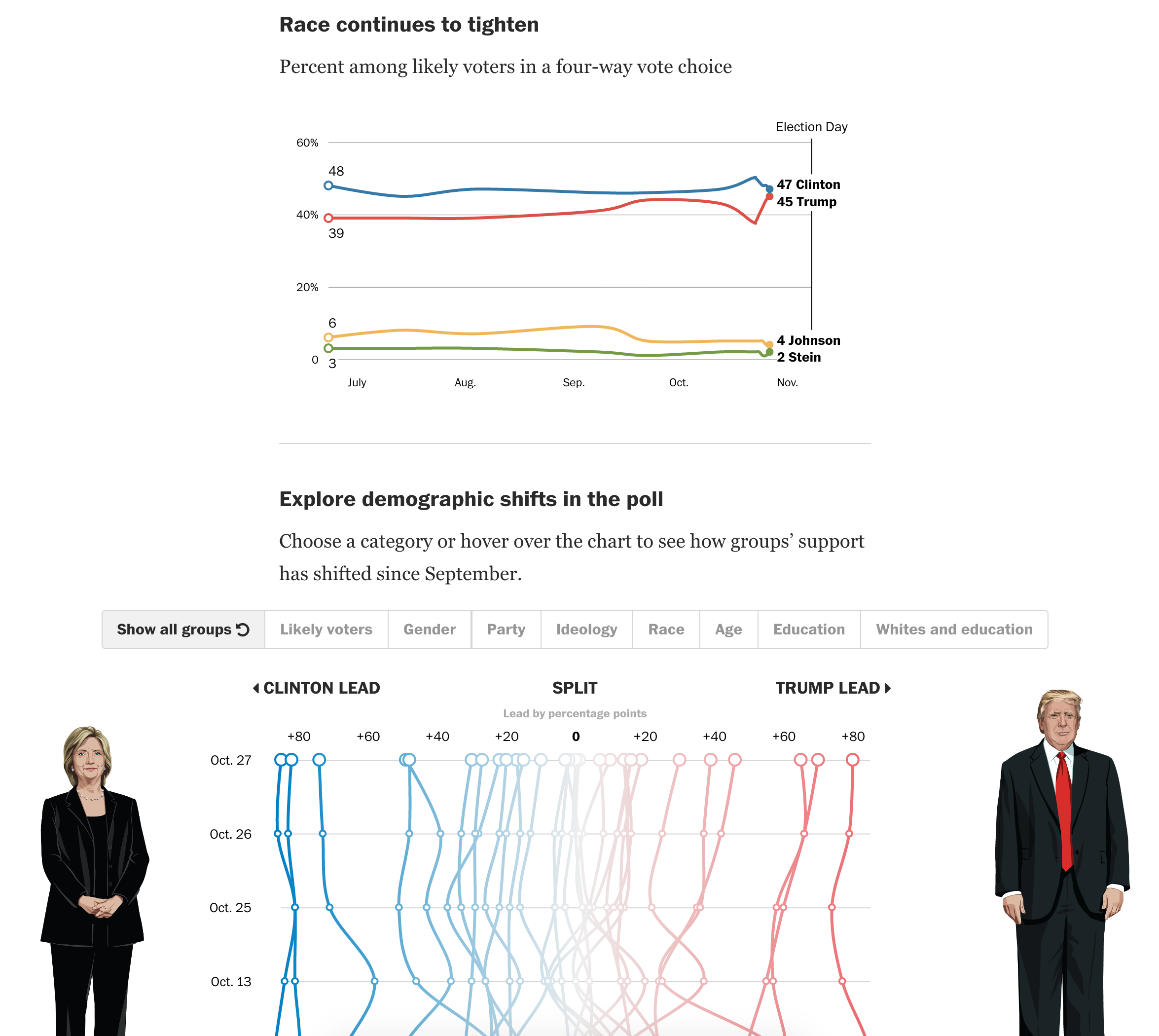
Today we start with the latest tracking polls, released on Friday. The piece comes from the Washington Post and highlights the closing gap between Clinton and Trump with a sudden spike in Republican candidate support. But what I really like about the piece is the plot below. It displays the 0 axis vertically and plots time with the most recent date at the top. And then support for the various demographics can be filtered by selectable controls above the overall plot.

Saturday's polling numbers
Saturday’s polling numbers

Of course the really interesting bit is going to be how much this changes in the next seven days. And then what that means for the results when we all wake up on Wednesday morning.

Credit for the piece goes to Chris Alcantara, Kevin Uhrmacher, and Emily Guskin.

Tying Up Time Warner and AT&T

AT&T is attempting to merge with Time Warner in order to have more/better control of a content pipeline. But as this Wall Street Journal article points out, the concept of tie-ups between media and telecoms is not exactly new. Especially since the breakup of the old Bell Telephone company.

Merging Time Warner and AT&T

Credit for the piece goes to the Wall Street Journal graphics department.

Timeline of Recent French Terrorism Attacks

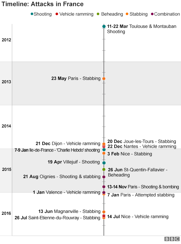
Yesterday the French Catholic community of Rouen was attacked by an alleged IS terror group. In the aftermath the BBC put together a graphic published inside a broader piece. The graphic documented the recent history of terror attacks in France.

When you read or scroll through the overall piece, a bit more symmetry could be added by aligning dates to the central column. That would make the dates more easily comparable. Though it should be noted the important point is made by the rapid clustering of events in the most recent time period.

And for a personal quibble, I believe that timelines are more effective when the most recent date is at the top. Presume the timeline starts in the 1950s during the middle of the Algerian War fought between France and Algeria, which at the time was an integral part of France. Would we want to read all those incidents from the 1950s and 60s? Likely no. Instead, we could scroll down the entirety of the piece. Here, however, we start in the relative calm of 2012, 2013, and early 2014.

Timeline of terror attacks in France

Credit for the piece goes to the BBC graphics department.

Bye Bye, Yahoo

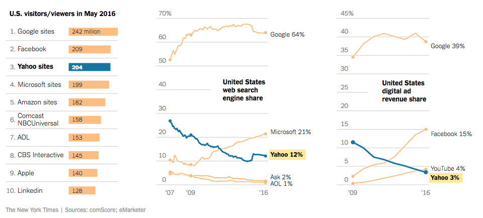
Happy Monday, all. Some big news stories going on today, but I wanted to take a look at this piece from the New York Times. They report on the sale of Yahoo to Verizon for almost $5 billion via a piece that takes short written analysis and blends it with clear and concise charting. The effect is a quickly digestible, but data-driven content piece.

The shares are falling, the shares are falling

Credit for the piece goes to Karl Russell.