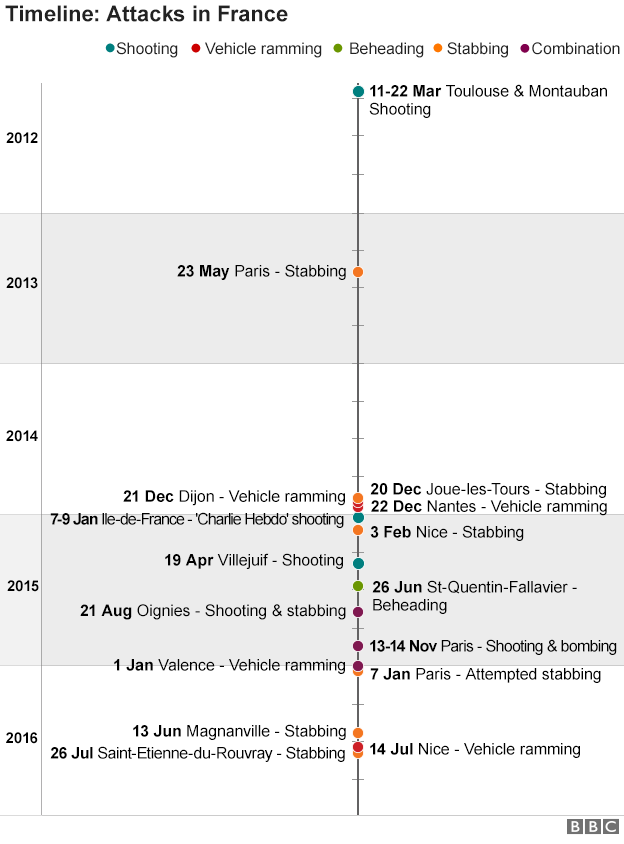
Yesterday the French Catholic community of Rouen was attacked by an alleged IS terror group. In the aftermath the BBC put together a graphic published inside a broader piece. The graphic documented the recent history of terror attacks in France.
When you read or scroll through the overall piece, a bit more symmetry could be added by aligning dates to the central column. That would make the dates more easily comparable. Though it should be noted the important point is made by the rapid clustering of events in the most recent time period.
And for a personal quibble, I believe that timelines are more effective when the most recent date is at the top. Presume the timeline starts in the 1950s during the middle of the Algerian War fought between France and Algeria, which at the time was an integral part of France. Would we want to read all those incidents from the 1950s and 60s? Likely no. Instead, we could scroll down the entirety of the piece. Here, however, we start in the relative calm of 2012, 2013, and early 2014.
Credit for the piece goes to the BBC graphics department.
Leave a Reply
You must be logged in to post a comment.