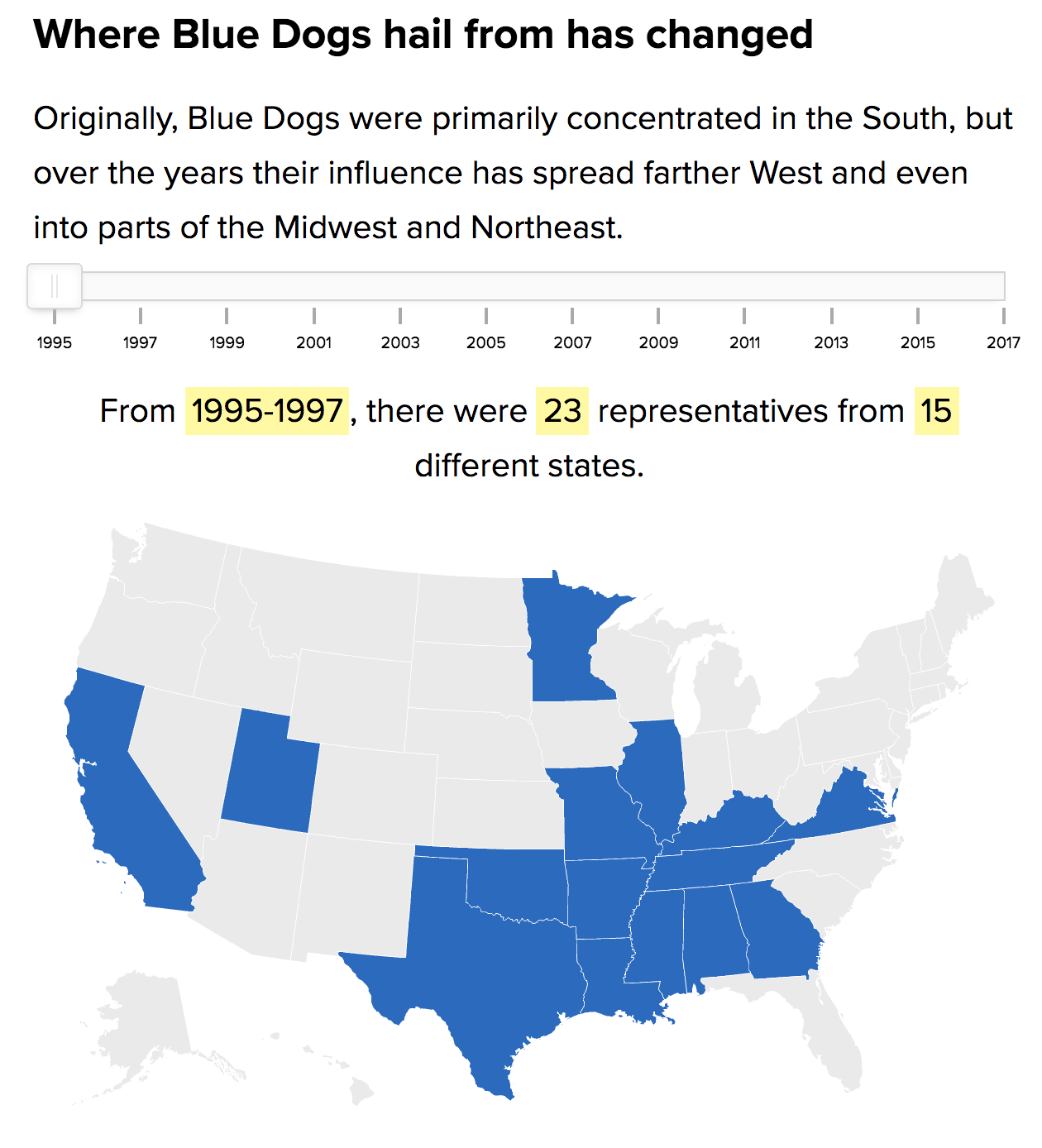
Last week I mentioned that it appeared Politico was running with articles featuring data visualisation. Just this morning I stumbled upon another article, this one about the Blue Dog Democrats. For those that do not know, Blue Dogs are basically a more conservative Democrat and were the remnants of the Democratic south. But in 2010, they got all but wiped out. This article looks at how and where they might just be coming back.

If this trend of data-driven and visualised content continues, the Politico could be doing some interesting work over the next year. By then we will be in a rather intense mid-term cycle and there might be some political news to coverage.
Credit for the piece goes to the Politico graphics department.
Leave a Reply
You must be logged in to post a comment.