
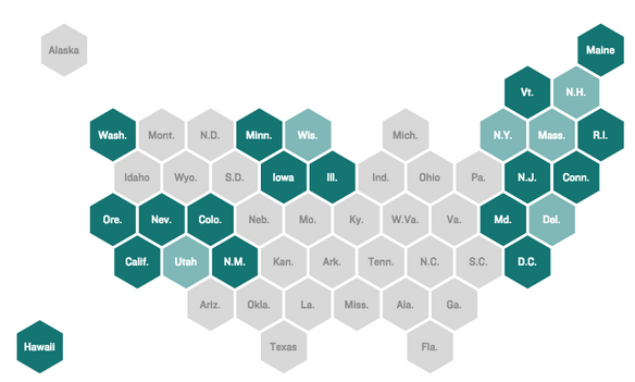
If you have not noticed, lots of news sites are using a variant of the cartogram lately. Basically, the idea is that geographic maps have the limitation of accurately representing landmass. And that means small polities, e.g. Rhode Island or Belgium, that might be quite important are visibly not so much, because they are geographically small. These pseudo-cartograms sort of do the trick by making all polities the same size. The trade off? Geographic fidelity. Anyway, there is an intelligent piece worth reading over at the NPR blogs explaining the thought process going on there about why to use the form. (You may recall I wrote about a similar project for London boroughs back in February.)
Credit for the piece goes to Danny DeBelius.