
There is a lot going on in the world—here’s looking at you Brexit vote today—but I did not want to miss this frightening article from the BBC on the melting of Greenland’s ice. It’s happening. And it’s happening faster than thought.
There are several insightful graphics, including the standard photo slider of before and after, a line chart showing the forecast rise of sea levels within the possible range. But this one caught my eye.
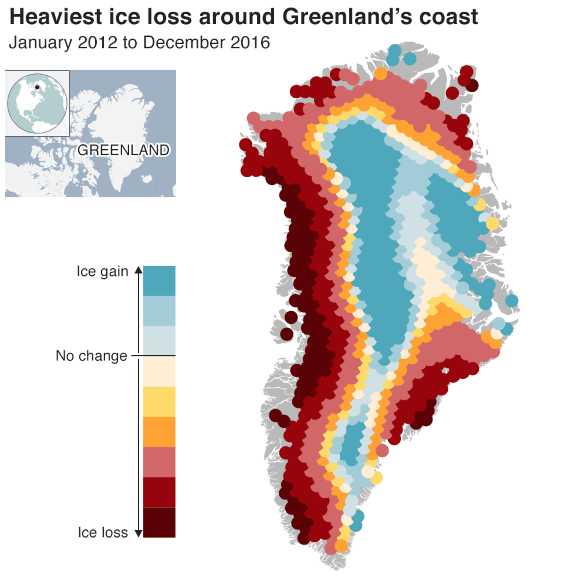
The colour palette here works fairly well. The darkest reds are not matched by a dark blue, but that is because the ice gain does not match the ice loss. Usually we might see a dark blue just to pair with a dark red, but again, we don’t because the designers recognised that, as another chart shows, the ice loss is outweighing the gains, though there are some to be found most notably at the centre of the ice sheets. This is a small detail, but something that struck me as impressive.
My only nitpick is that the legend does not quantify the amounts of gain or loss. That could show the extremes and reinforce the point that the loss is dwarfing the gain.
Credit for the piece goes to the BBC graphics department.