For all my American readers, I hope you all enjoyed their Labour Day holiday. For the rest of you, today is just a Tuesday. Unless you live in the Bahamas, then today is just another nightmarish day as Hurricane Dorian continues his assault on the islands.
The storm will be one for the record books when all is said and done, and not just because of the damage likely to be catastrophic when people can finally emerge and examine what remains. The storm, by several metrics, is one of the most powerful in the Atlantic since we started recording data on hurricanes. If we look at pressure and sustained wind speeds, i.e. not wind gusts, Sam Lillo has plotted the path of Dorian through those metrics and found it sitting scarily in the lower-right corner of this plot.
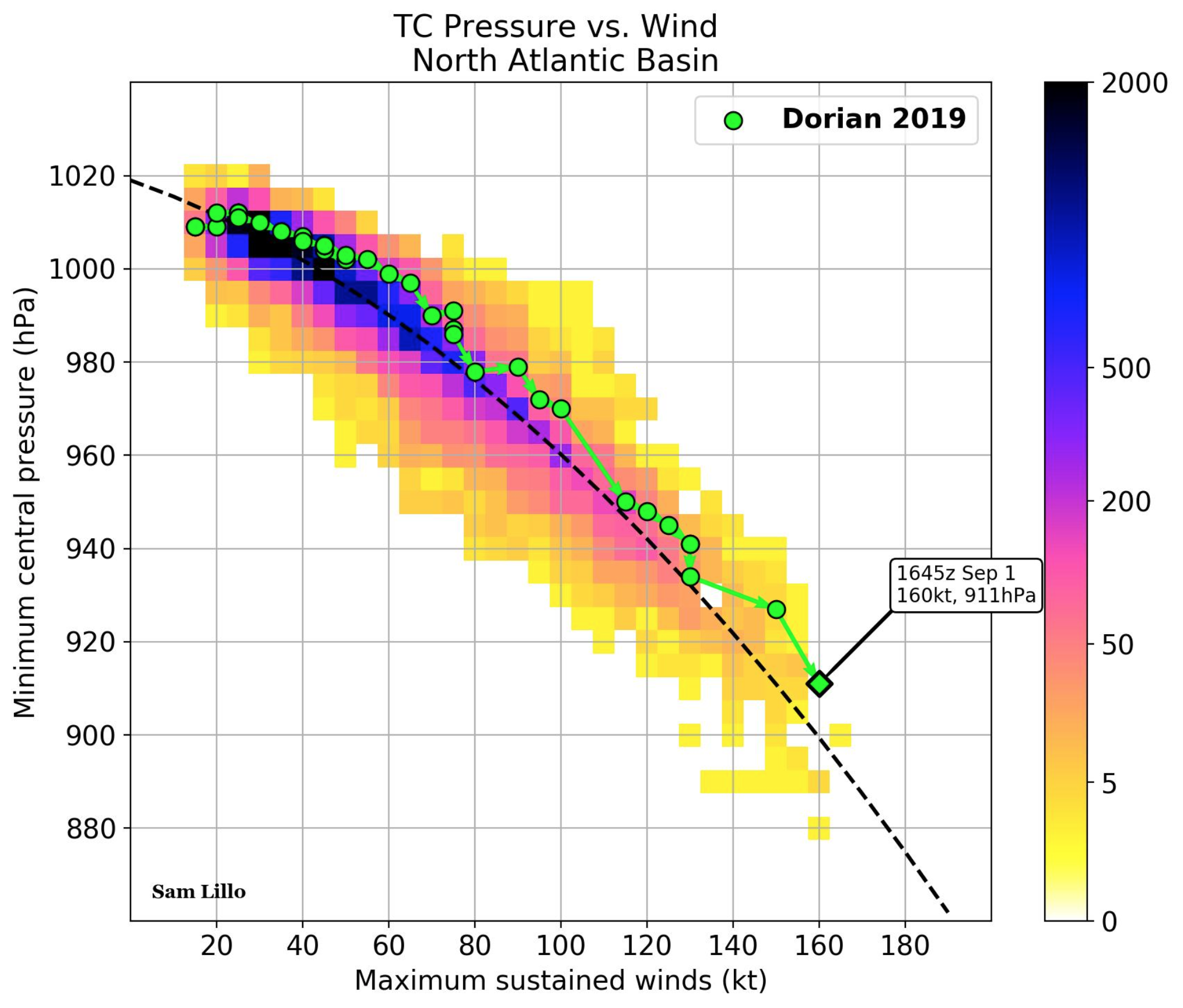
The graphic does a couple of nice things here. I like the use of colour to indicate the total number of observations in that area. Clearly, we see a lot more of the weaker, higher pressure storms. Hence the dark blue in the upper-left. But then against that we have the star of the graphic, and my favourite part of the plot: the plot over time of Dorian’s progress and intensification as a storm. The final green dot indicates the point of the last observation when the graphic was made.
Overall this is a simple and solid piece that shows in the available historical context just how powerful Dorian is. Unfortunately that correlates with likely heavy damage to the Bahamas.
Credit for the piece I presume goes to Sam Lillo, though with the Twitter one can never be entirely certain.
Leave a Reply
You must be logged in to post a comment.