
Baseball for the Red Sox starts on Friday. Am I glad baseball is back? Yes?
I love the sport and will be glad that it’s back on the air to give me something to watch. But the But the way it’s being done boggles the mind. Here today I don’t want to get into the Covid, health, and labour relations aspect of the game. But, as the title suggests, I want to look at a graphic that looks at just how bad the Red Sox could be this (shortened) year. And over at FiveThirtyEight, they created a model to evaluate teams’ starting rotations on an ongoing basis.
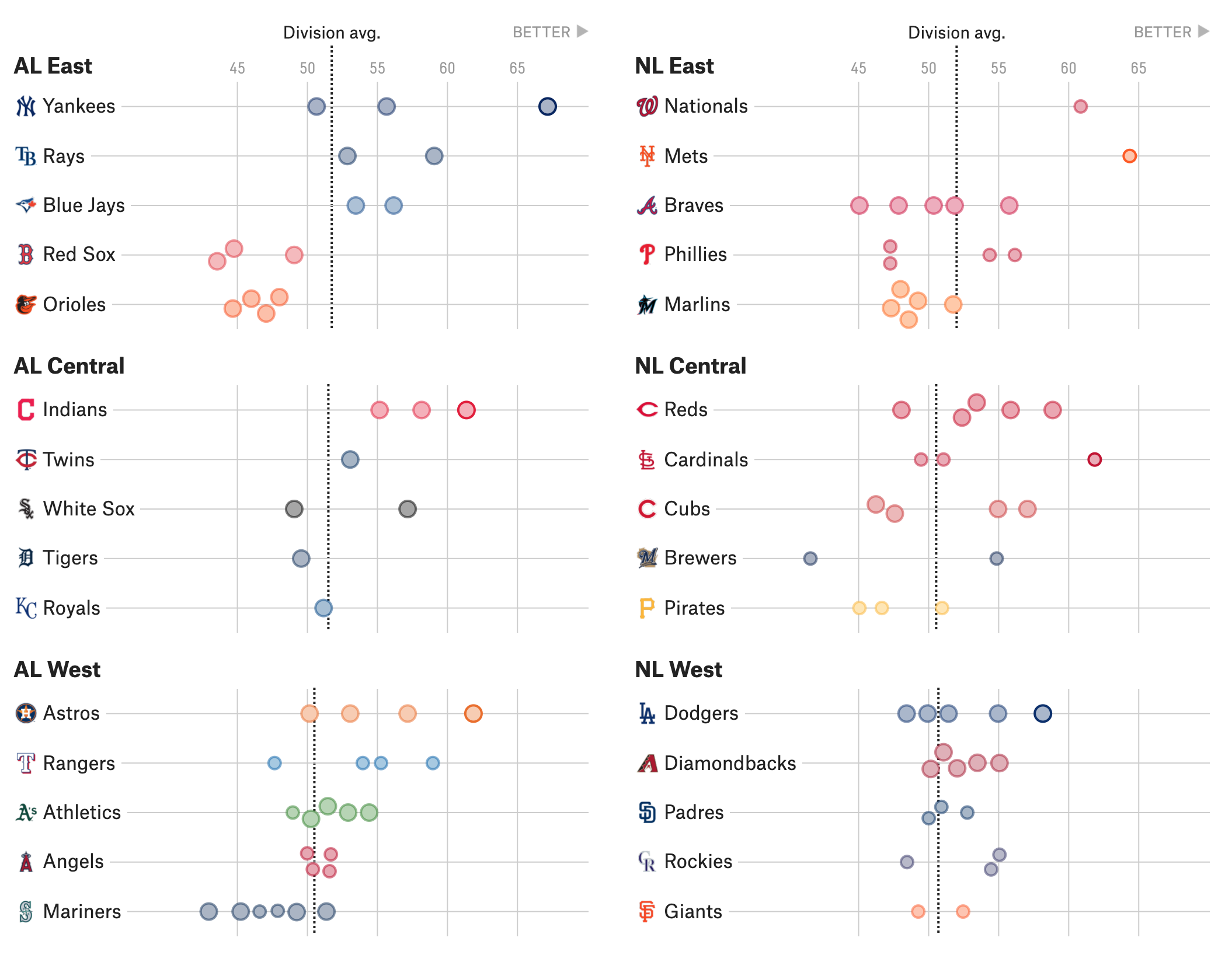
Form wise, this isn’t too difficult than what we looked at yesterday. It’s a dot plot with the dots representing individual pitchers. The size of the dots represents their number of total starts. This is an important metric in their model, but as we all know size is a difficult attribute for people to compare and I’m not entirely convinced it’s working here. Some dots are clearly smaller than others, but for most it’s difficult for me to clearly tell.
Colour is just tied to the colour of the teams. Necessary? Not at all. Because the teams are not compared on the same plot, they could all be the same colour. If, however, an eventual addition were made that plot the day’s matchups on one line, then colour would be very much appropriate.
I like the subtle addition of “Better” at the top of the plots to help the user understand the constructed metric. Otherwise the numbers are just that, numbers that don’t mean anything.
Overall a solid piece. And it does a great job of showing just how awful the Red Sox starting rotation is going to be. Because I know who Nate Eovaldi is. And I’ve heard of Martin Perez. Ryan Weber I only know through largely pitching in relief last year. And after that? Well, not on this graphic, but we have Eduardo Rodriguez who had corona and, while he has recovered, nobody knows how that will impact people in sports. There’s somebody named Hall who I have never heard of. Then we have Brian Johnson, a root for the guy story of beating the odds to reach the Major Leagues but who has been inconsistent. Then…it is literally a list of relief pitchers.
We dumped the salary of Mookie Betts and David Price and all we got was basically a tee-shirt saying “We still need a pitcher or three”.
Credit for the piece goes to Jay Boice.