Yesterday was murders in London and New York. Today, we have a nice article from FiveThirtyEight about deaths more broadly in America. If you recall, my point yesterday was that not all graphics need to be full column width. And this article takes that approach—some graphics are full width whereas others are not.
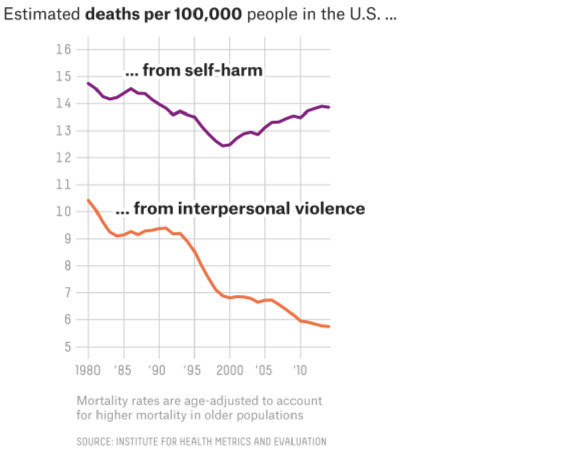
This screenshot shows a nice line chart that, while the graphic sits in the full column, the actual chart is only about half the width of the graphic. I think the only thing that does not sit well with me is the alignment of the chart below the header. I probably would align the two as it creates an odd spacing to the left of the chart. But I applaud the restraint from making the line charts full width, as it would mask the vertical change in the data set.
The screenshot is of the graphic’s full width, note the lines only go a little over half the width.
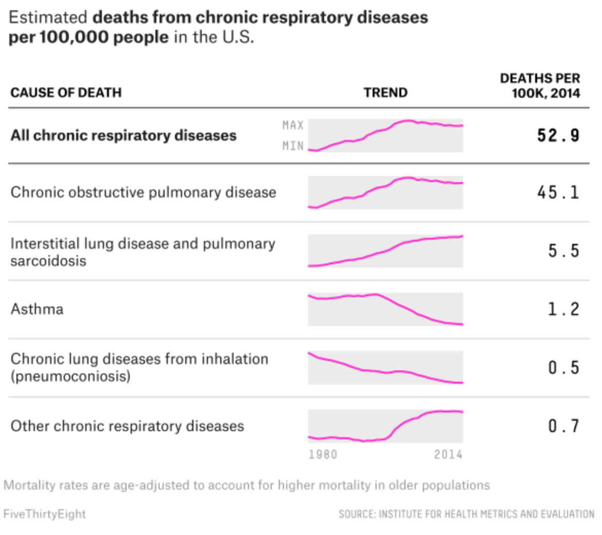
Meanwhile, the article’s maps all sit in the full column. But my favourite graphic of the whole set sits at the very end of the piece. It examines respiratory deaths in a tabular format. But it makes a fantastic use of sparklines to show the trend leading towards the final number in the row.
Loving the sparklines…
Credit for the piece goes to Ella Koeze and Anna Maria Barry-Jester.
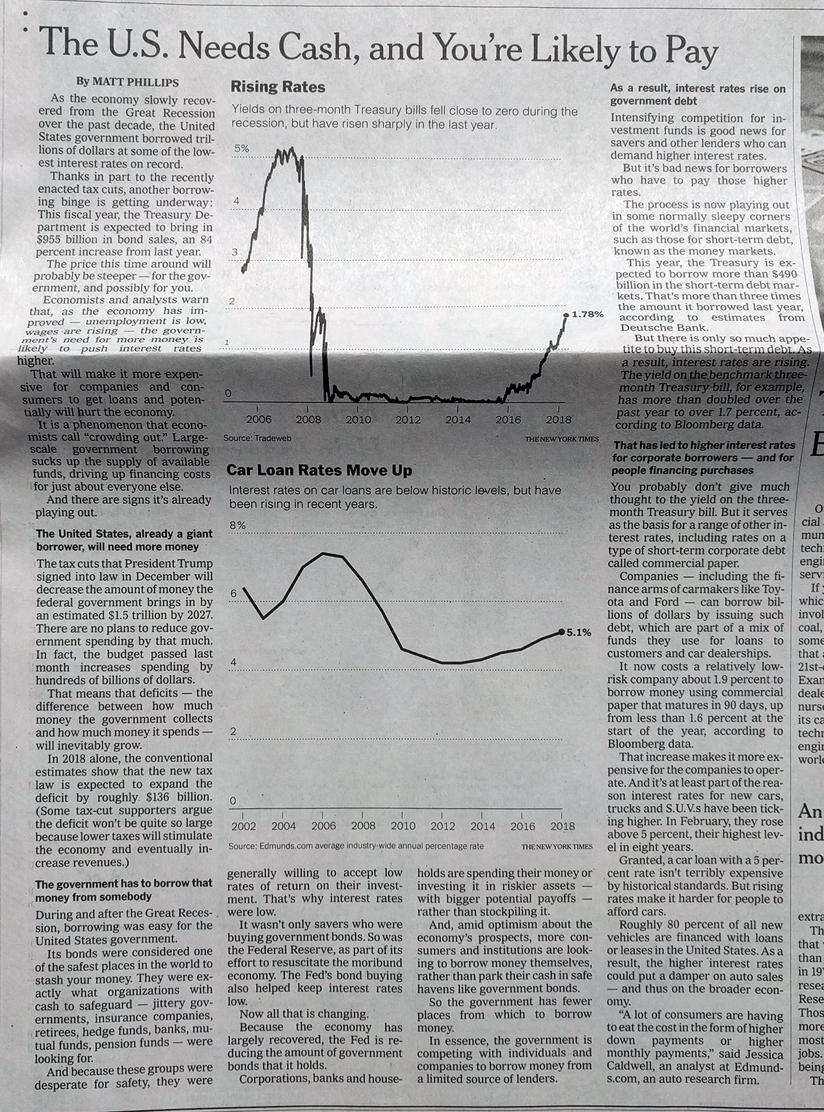
I know I’ve looked at the Times a few times this week, but before we get too far into the next week, I did want to show what they printed on Saturday.
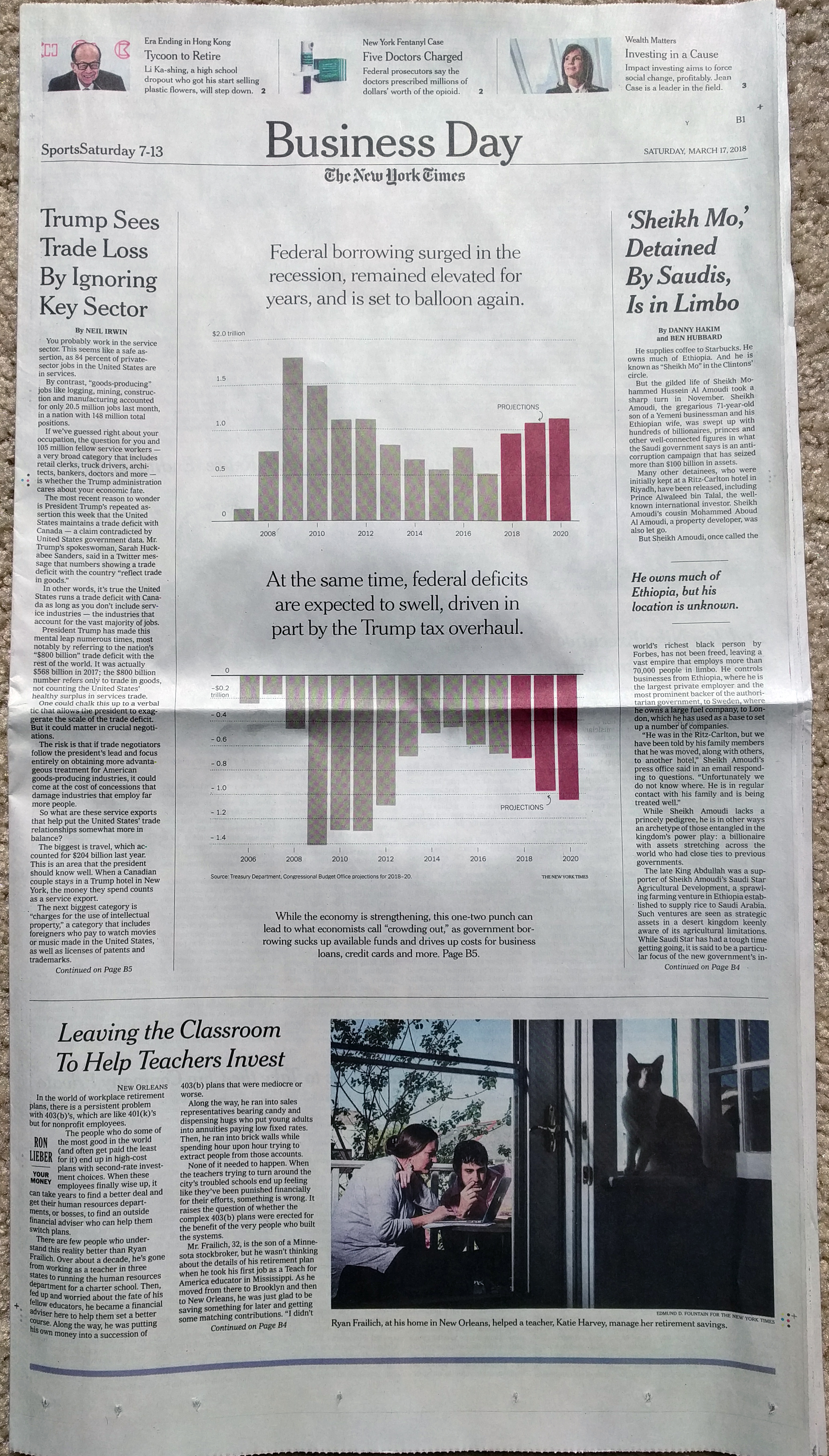
It is not too often we get treated to data on the front page or even the section pages. But last Saturday we got just that in the Business Section. Two very large and prominent charts looked at federal government borrowing and the federal deficit. Both are set to grow in the future, largely due to the recently enacted tax cuts.
That’s about half the page on those two charts.
The great thing about the graphic is just how in-the-face it puts the data. Do two charts with 14 data points (28 total) need to occupy half the page? No. But there is something about the brashness of the piece that I just love.
And then it continues and the rest of the article points, at more normal sizes, to treasury bill yields and car loan rates. The inside is what you would expect and does it well in single colour.
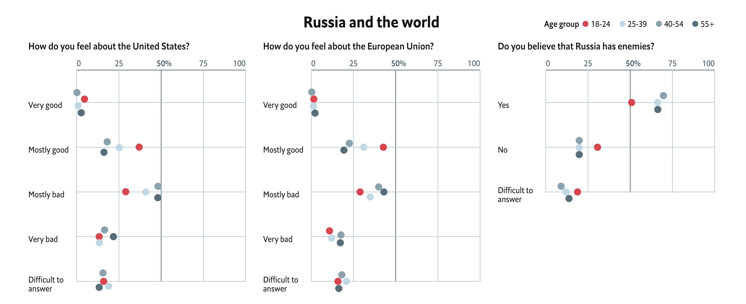
In news that surprises absolutely nobody, Russia “re-elected” Vladimir Putin as president for another six-year term. The Economist recently looked at what they termed the Puteens, a generation of Russians born starting in 1999 who have no memory of a Russia pre-Vladimir Putin.
This piece features a set of interactive dot plots that capture survey results on a number of topics that are segmented by age. It attempts to capture the perspective of Puteens on a range of issues from their media diet to foreign policy outlook to civil rights.
The ideas of youth…
The design is largely effective. The Puteen generation sticks out clearly as the bright red to the cool greys. And more importantly, when the dots would overlap they move vertically away from the line so users can clearly see all the dots. And on hover, all the dots of the same age cohort’s interest are highlighted. I think one area of improvement would have been to apply that same logic to the legend to allow the user to scroll through the whole dataset without always having to interact with the chart. But that is a minor bit on an otherwise really nice piece.
Credit for the piece goes to the Economist’s graphics department.
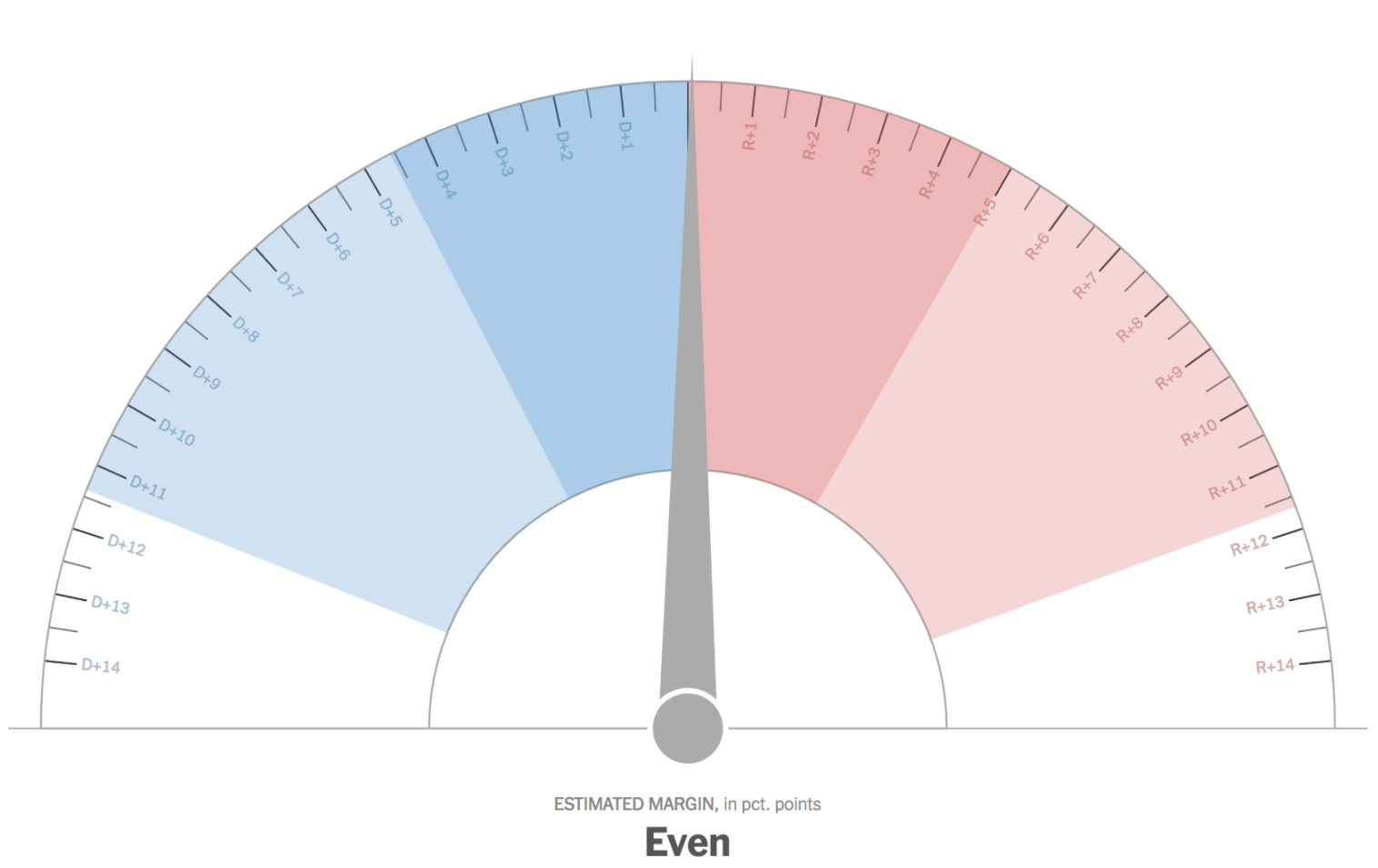
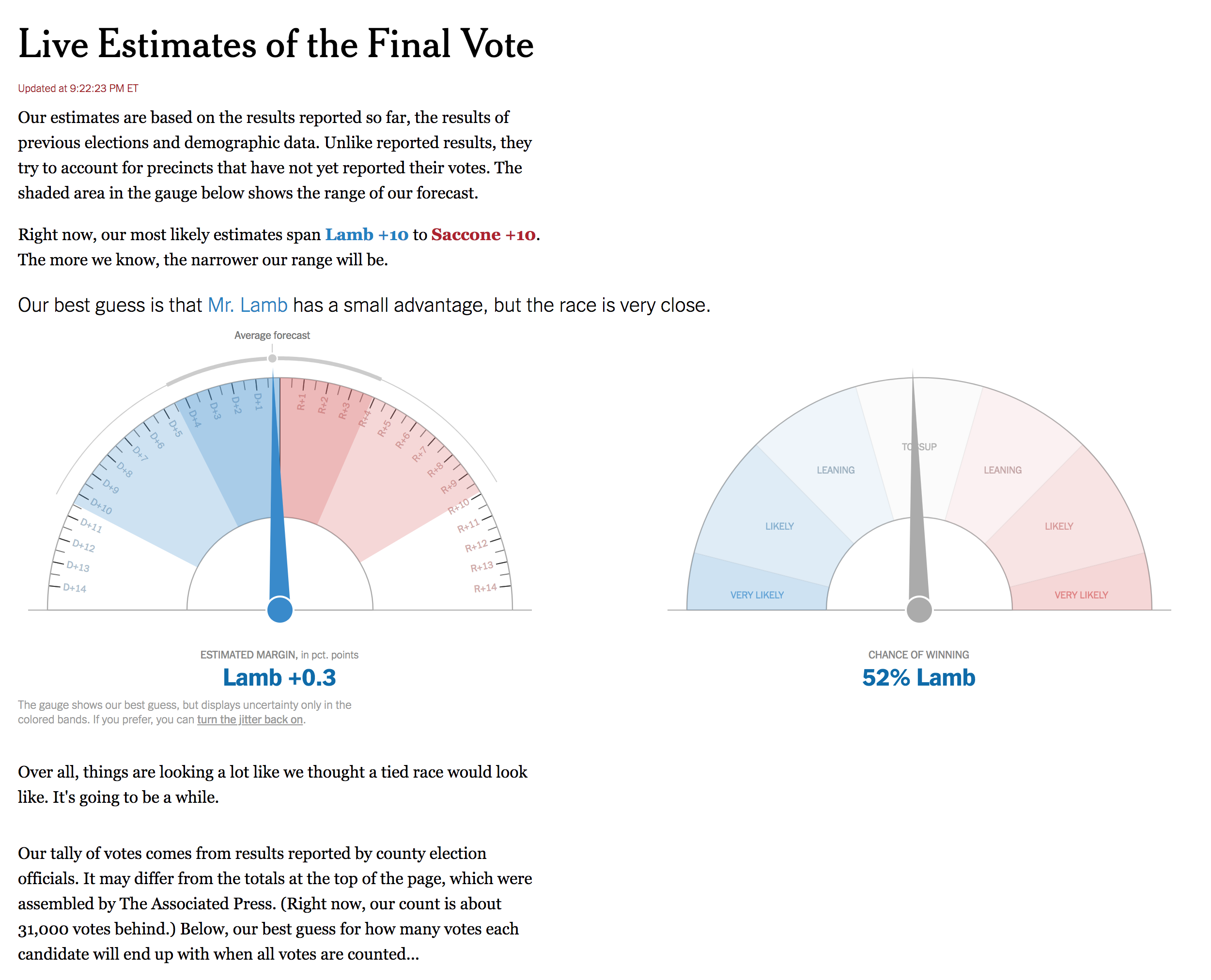
I am exhausted. I tried to stay up late enough to catch the absentee ballots from Washington County. Alas, I did not quite make it. (You better bet I will be drinking all the caffeine today.) But someone else did not quite make it through the night. Or rather, something. What was it? The New York Times election night needle.
To understand why the Times made the needle, read this really great explainer. The super short version: it tries to forecast the results of that particular election day, accounting for things like uncounted votes. On television, analysts and large interactive screens can show how, usually, urban districts are counted first then followed by slower-to-return rural areas. But for people following results solely online, those nuances might well be lost. Enter the needle.
Trust the Needle
Last night, like much of the Twitterverse I follow for politics, I had the needle open in one tab. But as the results began to come in, something odd was happening on the Times’ results page. The votes were being displayed in a precinct-by-precinct fashion in Allegheny, Washington, and Greene Counties. But Westmoreland was oddly grey. It turned out, the county elections board was not, I suppose, digitally publishing the precinct results, only county-wide.
Whilst the Needle spins…
Fun fact, the needle’s model is apparently built on precinct results. So how do you have a needle if something like 30% of the model’s required or expected data will not be available? The Times tweeted about it a few times, but ultimately pulled it down. Better to not have it and be right than have it wrong just to have it.
Needle down…
But that brings me to the second point about the needle. Well done to BuzzFeed’s Decision Desk HQ, who were presciently concerned about the ability of the county to get precinct level results up online. So they sent a reporter, as in a human being, to Westmoreland to get the analogue results and then upload them to BuzzFeed’s own results spreadsheet. (I never did find a BuzzFeed live results page.)
Who knows the budget difference between the New York Times’s graphics/politics desks and that of BuzzFeed’s, but the ability to put a single person in Westmoreland made the difference for BuzzFeed, whose coverage via Decision Desk HQ, made for a more compelling following because they were, old school like, reading out results as they came in via reporters. And because there were no exit polls in the election, we had to wait for all the votes. Strangely, it almost felt like watching a UK general election where you have to wait hours for some constituencies to announce results. Though this election had a noticeable lack of Raving Monster Loony candidates.
I bring up the BuzzFeed contribution to the night because it does show how sometimes the sheer fact of placing a reporter on the ground can yield tremendous results. Come November, no, I don’t think any single media organisation can afford to put a reporter in every single US county. But I would bet the Times will be working on how to better precinct proof their needle.
Credit for the piece goes to Nate Cohn, Josh Katz, Sarah Almukhtar, and Matthew Bloch.
Europe enjoyed some significant political news yesterday. First, Angela Merkel will serve a fourth term as chancellor as the SPD members voted to allow their party to enter into a grand coalition with Merkel’s CDU/CSU party.
But the more important story is that of the Italian elections, where the centre-left under Matteo Renzi was attempting a comeback against the populist parties the 5-Star Movement and the League, the latter an anti-immigrant party. Also in the mix was Silvio Berlusconi, whose Forza party won 14% of the vote and as a member of a right/centre-right bloc that won 37%.
So I chose to highlight the homepage of IL Sore 24 Ore, an Italian newspaper, that had the results displayed clearly.
Live results at the top of the home page
Of course the big problem is that I can neither read nor speak Italian. So figuring out just what every label is proved to be a bit tricky. But once you figure it out, it is quite clear. The nice blue banner for the real-time results (again with the assuming of translation) does a nice job of clearly separating itself from the rest of the page, but the tables inside are quiet and not screaming for attention. Instead the user is allowed to find his or her party of bloc of interest and then scan to the right for the bold number of seats in the respective chamber.
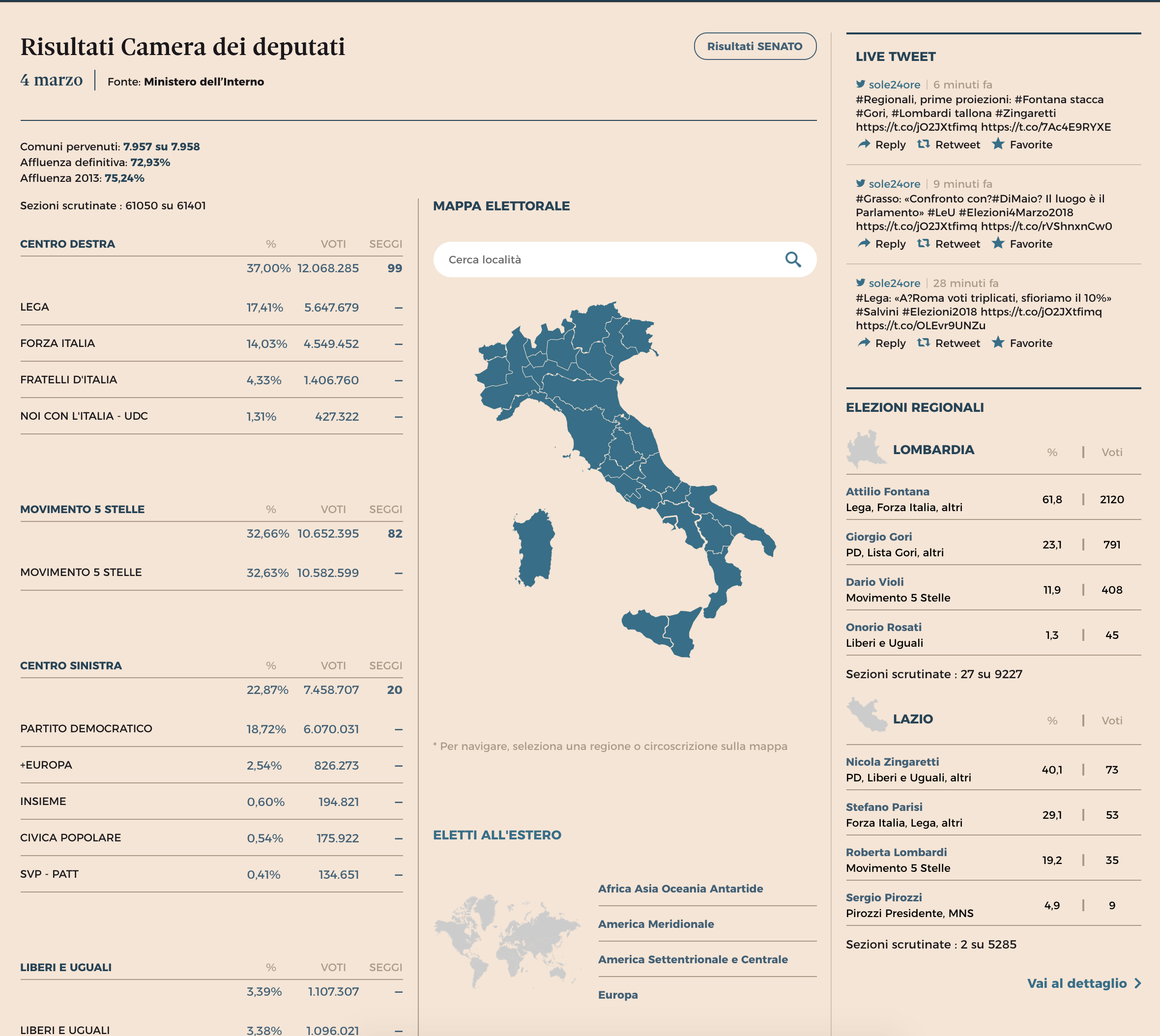
The results page is similarly nice, using clean and simple tables to organise the information. Using the Chamber of Deputies page as an example, the overall results appear on the left while important context via maps and specific regions appear to the right. All the while the use of simple typography and whitespace guide the user to the appropriate data set.
These are the results for the Chamber of Deputies, the equivalent to the US House or House of Commons
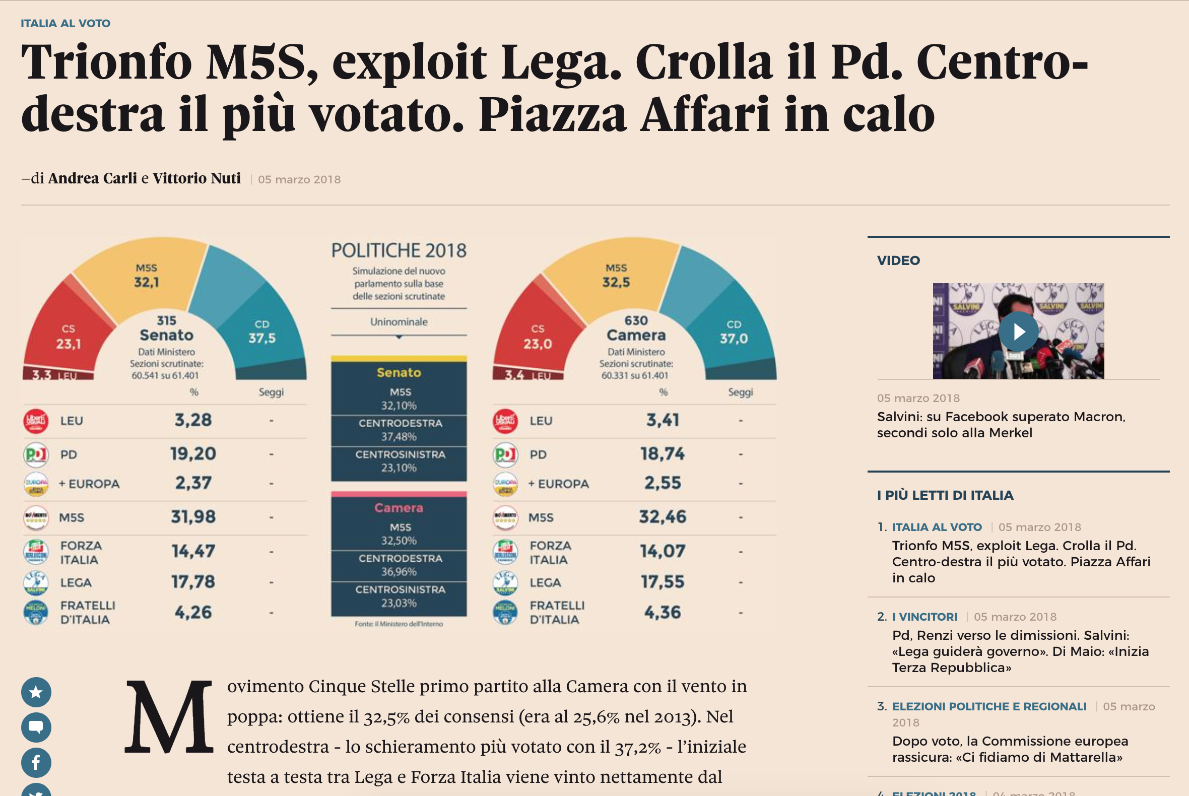
And lastly a screenshot of an article about the election results, none of which I can read. Here, instead of an interactive table or graphic, we have a static graphic showing the results. It certainly captures the results in this particular moment—exact seat numbers have not yet been released—but could grow stale as the day goes on. Although there very well could be a page with interactive results like this, but that I cannot find because, again, I cannot read Italian.
The centre-right bloc did well, as did the 5-Star Movement (M5S)
The design of the graphic is nice. It uses the popular half-circle arc to show who “crosses the finish line” in terms of blocs seating more than 50% of the chamber. But once again, I am most impressed by the clarity of the table and information displays through white space and typography. (Though I feel in this case white space should be more like light salmon-coloured space.)
Overall, the designers did a fantastic job of presenting the data and information, so well that a non-Italian could even figure it out.
Credit for the piece goes to the Il Sore 24 Ore graphics department.
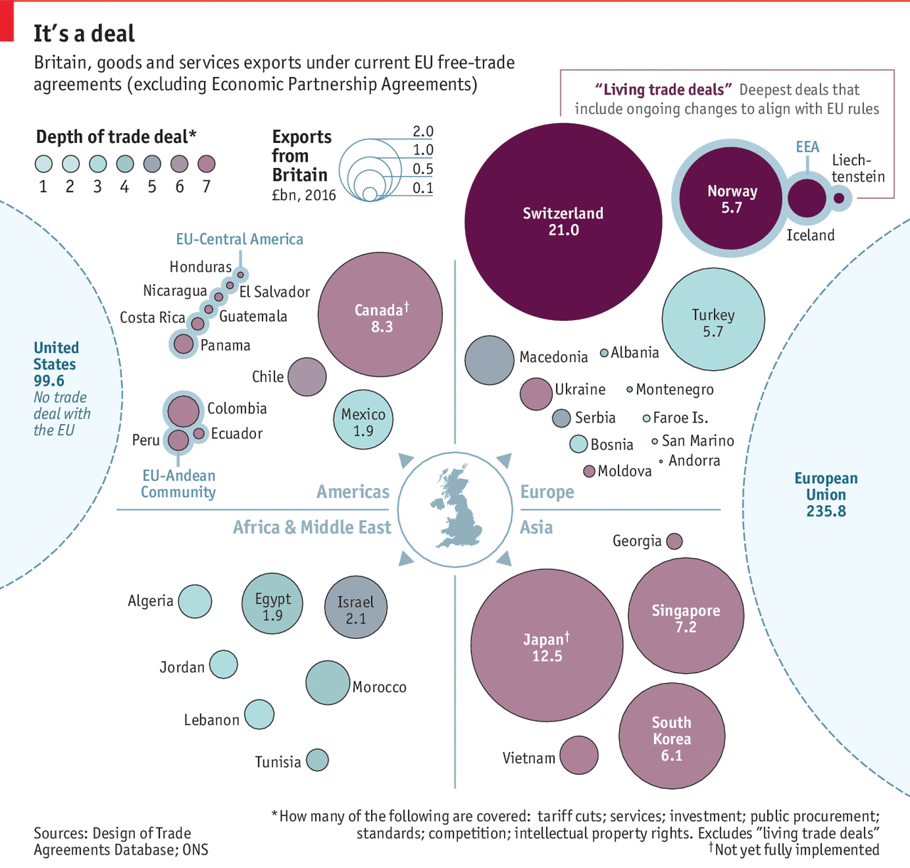
Off of yesterday’s piece looking at the potential slowdown in British economic growth post-Brexit, I wanted to look at a piece from the Economist exploring the state of the UK’s current trade deals.
Still loathe the use of bubbles though…
I understand what is going on, with the size of the bubbles relating to British exports and the colour to the depth of the free trade deal, i.e. how complex, thorough, and wide-ranging. But the grouping by quadrant?
With trade, geographical proximity is a factor. Things that come from farther cost more because fuel, labour time, &c. One of the advantages the UK currently has is the presence of a massive market on its doorstep with which it already has tariff- and customs-less trade—the European Union.
Consequently, could the graphic somehow incorporate the element of distance? The problem would be how to account for routes, modes of transport, time—how long does a lorry have to queue at the border, for example. Alas, I do not have a great answer.
Regardless of my concepts, this piece does show how the most valuable trade partners already enjoy the deepest and largest trade deals, all through the European Union. And so the UK will need to work to replicate those deals with all of these various countries.
Credit for the piece goes the Economist Data Team.
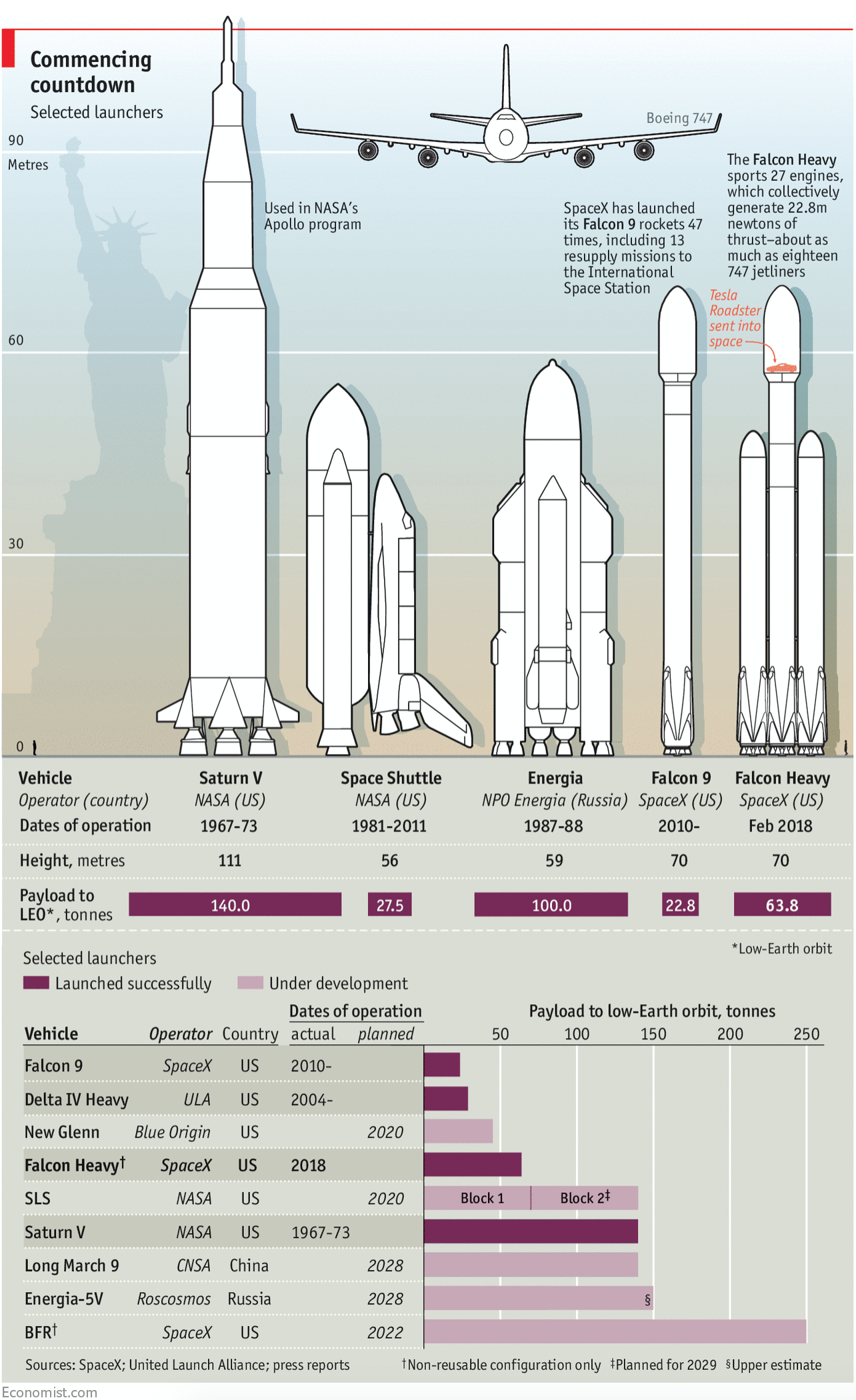
Yesterday SpaceX launched the Falcon Heavy rocket on its maiden voyage, and then recaptured several, though not all, of its reusable rockets. The Falcon Heavy represents the most powerful rocket available to mankind today, though NASA’s Saturn V of the Apollo programme era was considerably more powerful. That was all the stuff you could read in the news yesterday and today.
But how much more powerful? Thankfully we have the Economist who put together a nice graphic detailing not just the standard size comparisons of the Falcon series to the Saturn V and other famous rocket systems, e.g. the Space Shuttle and its boosters. The Economist graphic also adds information about the payload capabilities and timeframes for either historical operation or expected service dates.
It’s big and powerful, but SpaceX still has a long way to go…
From the illustrative side, there were three really nice touches. First, the faint Statue of Liberty to give the rocket height context to famous landmark buildings. Two, the little human figure on the left-hand side to give context to ourselves, these things are big. Three, the ridiculousness of the Saturn V is captured by having its peak break the top frame of the chrome or graphic device, i.e. the red bar, standard on Economist graphics.
Overall a solid piece. (Yes, I know these are liquid fueled.)
Credit for the piece goes to the Economist’s graphics team.
A few days ago I posted about the front cover graphic for the New York Times that used a choropleth to explore 2017 economic growth. Well, this morning whilst looking for something else, I came across the online version of the story. And I thought it would be neat to compare the two.
A very nice graphic
Again, nothing too crazy going on here. But the most immediately obvious change is the colour palette. Instead of using that green set, here we get a deep, rich blue that fades to light very nicely. More importantly, that light tan or beige colour contrasts far better against the blue than the green in the print version.
The other big change is to the small multiple set at the bottom. Here they have the space to run all twelve datasets horizontally. In the earlier piece, they were stacked six by two. It worked really well, but this works better. Here it is far easier to compare the height of each bar to the height of bars for other countries.
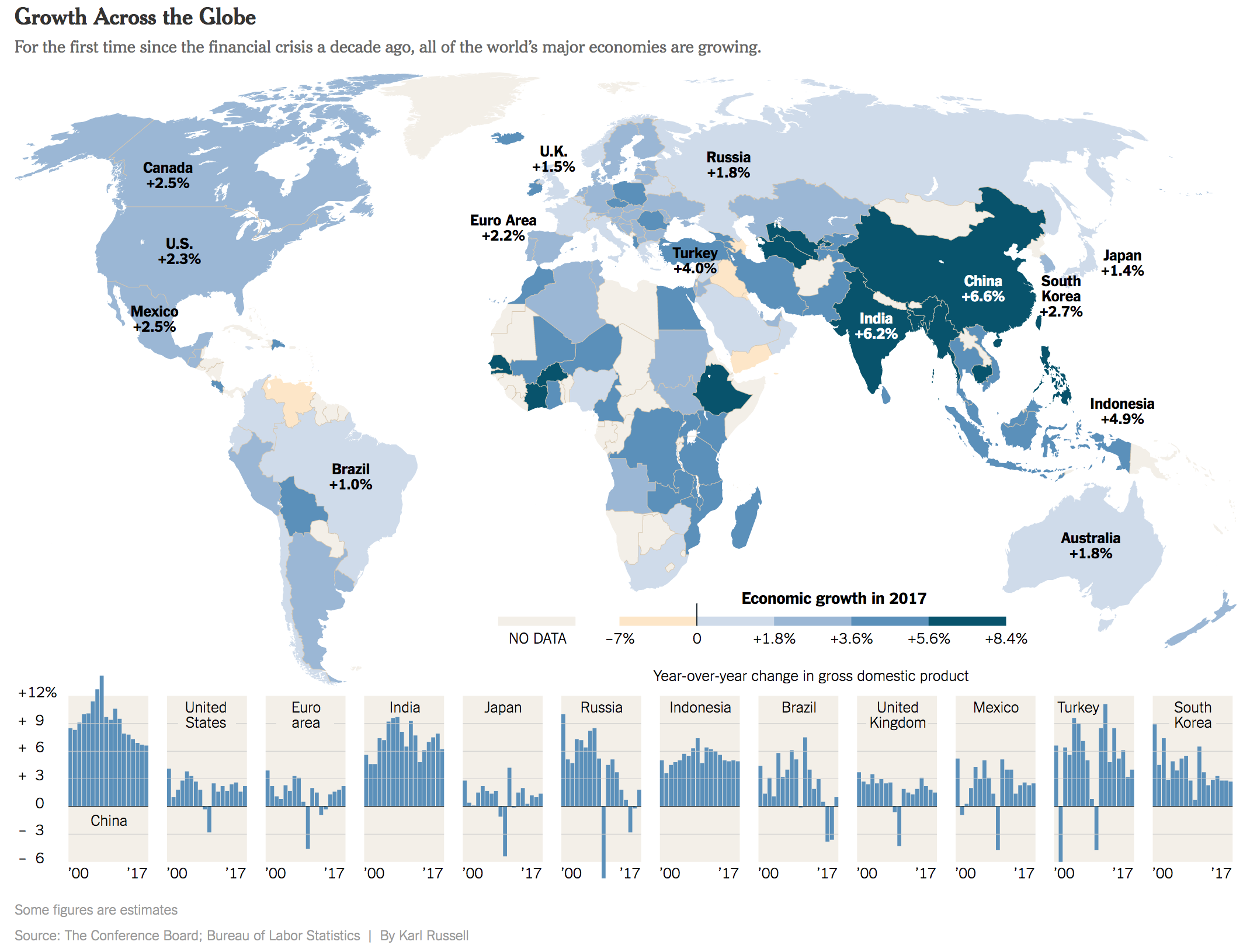
Earlier this month I wrote-up a piece from the Economist that looked at 2018 GDP growth globally. I admitted then—and still do now—that it was an oddly sentimental piece given the frequency with which I made graphics just like that in my designer days of youth and yore. Today, we have the redux, a piece from the New York Times. Again, nothing fancy here. As you will see, we are talking about a choropleth map and bar charts in small multiple format. But why am I highlighting it? Front page news.
Choropleth on the front page? More please.
I just like seeing this kind of simple, but effective data visualisation work on the front page of a leading newspaper.
Lots of green on that map
I personally would have used a slightly different palette to give a bit more hint to the few negative growth countries in the world—here’s lookin’ at you, Venezuela—but overall it works. And the break points in the bin seem a bit arbitrary unless they were chosen to specifically highlight the called-out countries.
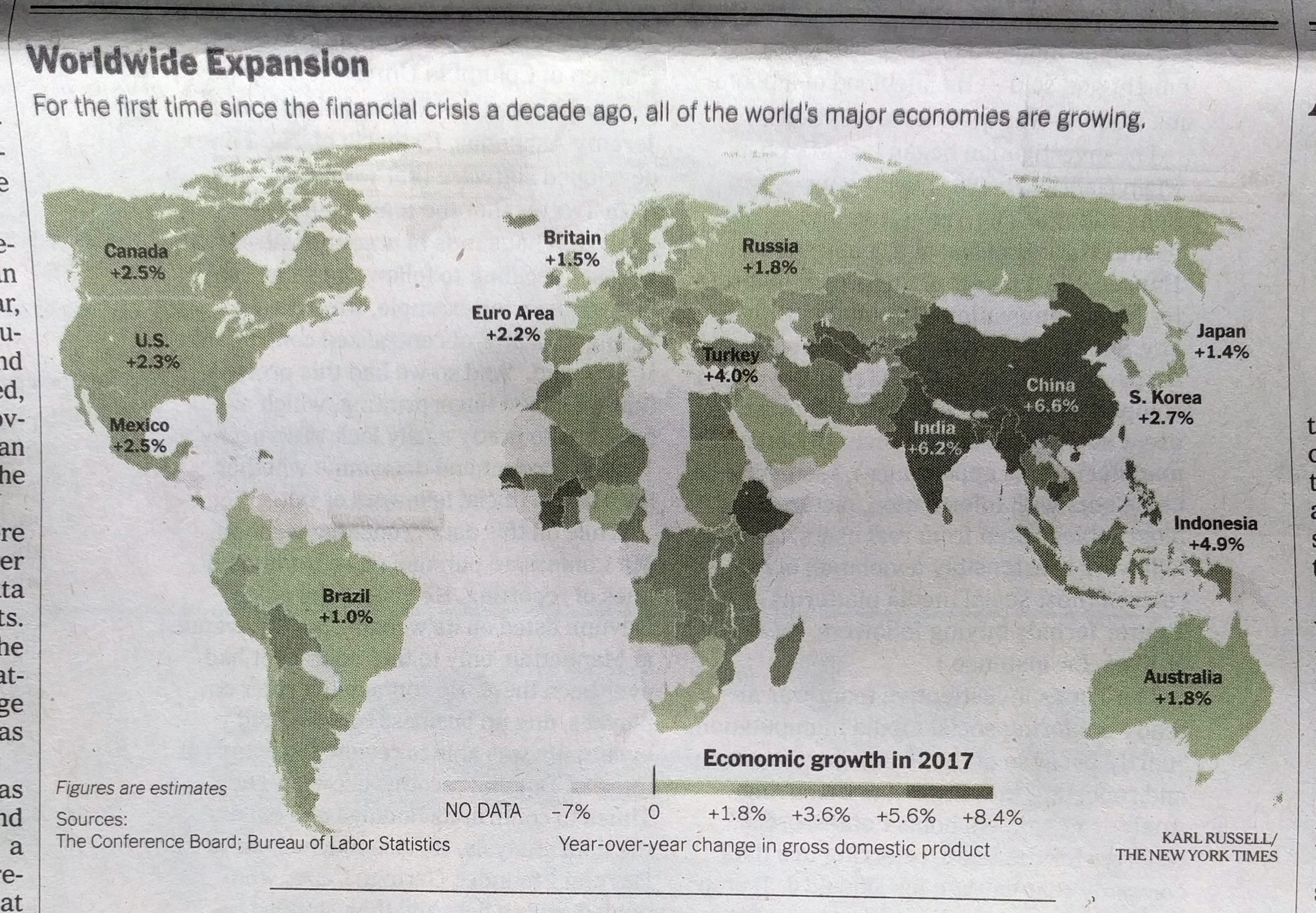
Then on the inside we get another small but effective graphic.
Page 4
It doesn’t consume the whole page, but sits quietly but importantly at the top of the article.
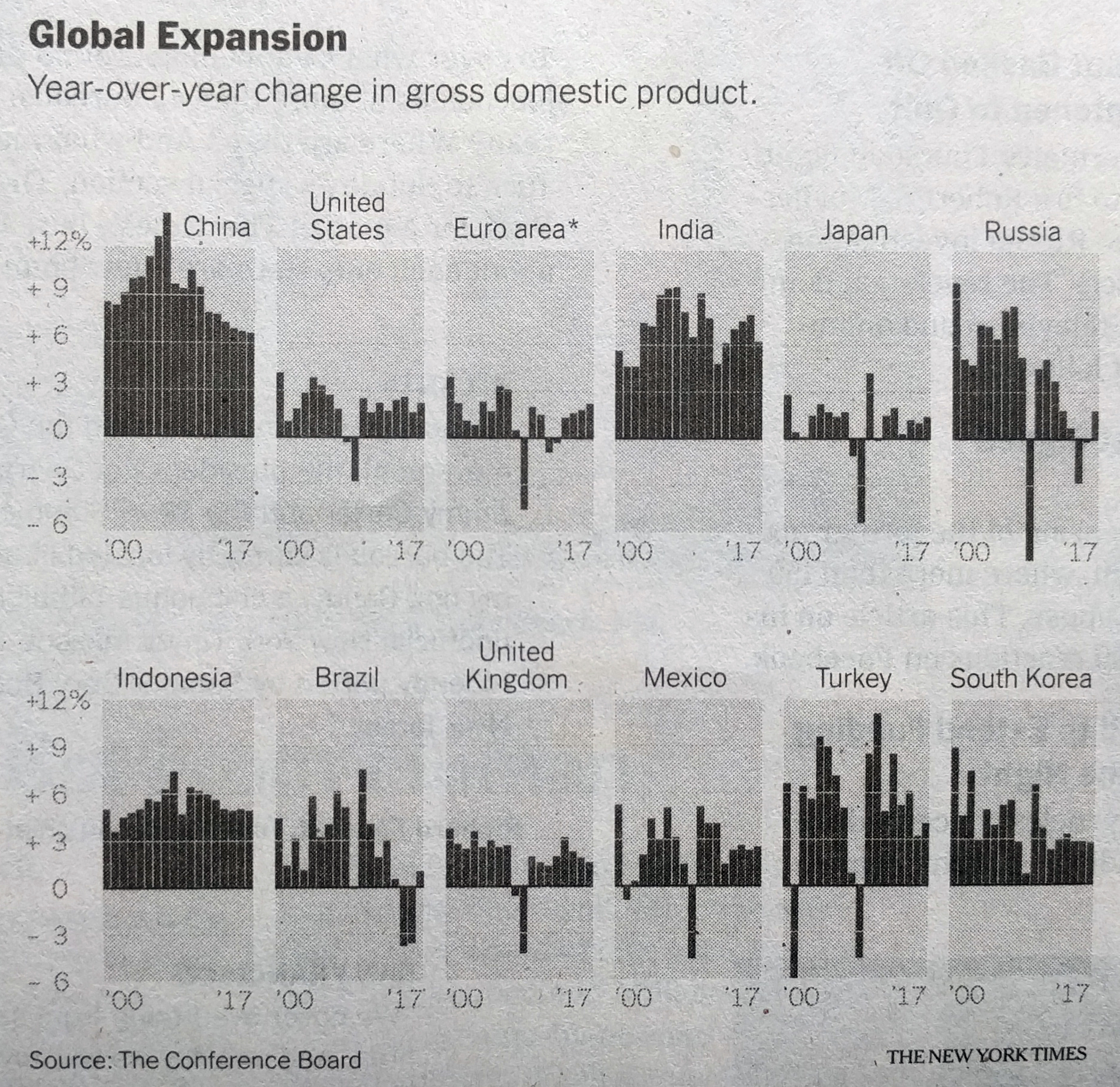
The world’s leading economies, on their own
There the small multiples show the year-on-year change—nothing fancy—for the world’s leading economies. A one-colour print, it works well. But, I particularly enjoy the bit with China. Look at how the extreme growth before the Great Recession is handled, just breaking out of the container. Because it isn’t important to read growth as 13.27% (or whatever it was), just that it was extremely high. You could almost say, off the charts.
Overall, it was just a fun read for a Sunday morning.
Credit for the piece goes to Karl Russell and the New York Times graphics department.