Yesterday was murders in London and New York. Today, we have a nice article from FiveThirtyEight about deaths more broadly in America. If you recall, my point yesterday was that not all graphics need to be full column width. And this article takes that approach—some graphics are full width whereas others are not.
This screenshot shows a nice line chart that, while the graphic sits in the full column, the actual chart is only about half the width of the graphic. I think the only thing that does not sit well with me is the alignment of the chart below the header. I probably would align the two as it creates an odd spacing to the left of the chart. But I applaud the restraint from making the line charts full width, as it would mask the vertical change in the data set.

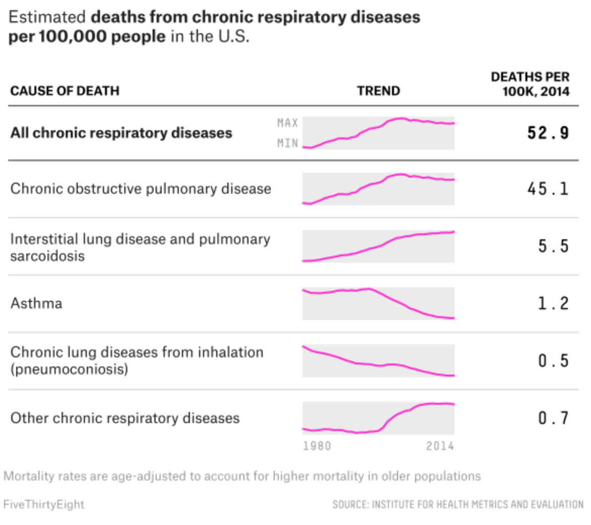
Meanwhile, the article’s maps all sit in the full column. But my favourite graphic of the whole set sits at the very end of the piece. It examines respiratory deaths in a tabular format. But it makes a fantastic use of sparklines to show the trend leading towards the final number in the row.

Credit for the piece goes to Ella Koeze and Anna Maria Barry-Jester.
Leave a Reply
You must be logged in to post a comment.