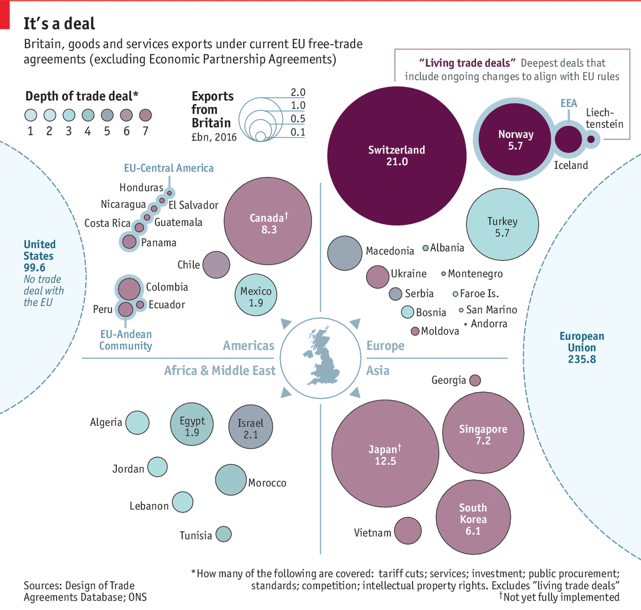
Off of yesterday’s piece looking at the potential slowdown in British economic growth post-Brexit, I wanted to look at a piece from the Economist exploring the state of the UK’s current trade deals.

I understand what is going on, with the size of the bubbles relating to British exports and the colour to the depth of the free trade deal, i.e. how complex, thorough, and wide-ranging. But the grouping by quadrant?
With trade, geographical proximity is a factor. Things that come from farther cost more because fuel, labour time, &c. One of the advantages the UK currently has is the presence of a massive market on its doorstep with which it already has tariff- and customs-less trade—the European Union.
Consequently, could the graphic somehow incorporate the element of distance? The problem would be how to account for routes, modes of transport, time—how long does a lorry have to queue at the border, for example. Alas, I do not have a great answer.
Regardless of my concepts, this piece does show how the most valuable trade partners already enjoy the deepest and largest trade deals, all through the European Union. And so the UK will need to work to replicate those deals with all of these various countries.
Credit for the piece goes the Economist Data Team.
Leave a Reply
You must be logged in to post a comment.