Oh Cal Richards…
But anyways, according to the National Bureau of Economic Research—the people who declare when recessions and such begin and end—the recession that began in December 2007 ended in June 2009. Good news of a sort. And so naturally the press covered it, including the Wall Street Journal.
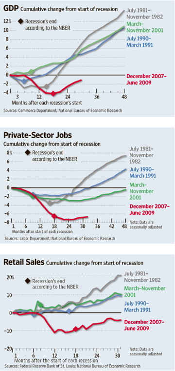
They included this image:

One, the drop shadows are unnecessary and the giant diamonds hide the actual turning point. The former could be eliminated and therefore allow the line to have greater, crisper detail as the colour should be enough to differentiate the lines. The drop shadow just sort of blurs everything together. The diamond could either be smaller or simply denoted on the timeline and thus allow the entirety of the line to be shown.
What I do appreciate, however, is that the first two charts show the same timeline and therefore allow for an easy comparison of the GDP turnaround to the jobs turnaround. And as one can see, while the recession has ended, if this most recent one is to follow in the paths of its predecessors, jobs will be a long time in returning to pre-recessionary levels.
Leave a Reply
You must be logged in to post a comment.