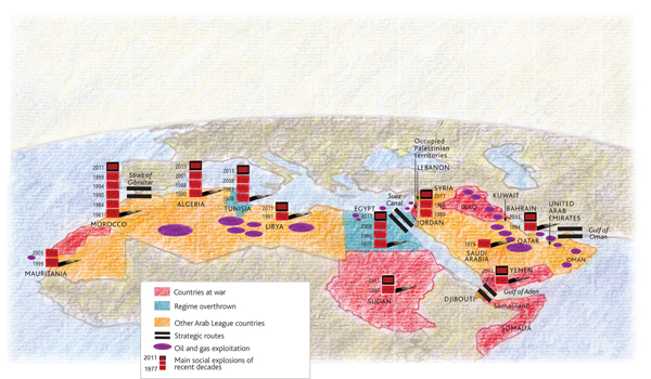
Le Monde is a French-language publication and so I never really bother with it, despite favourable reviews. However, they do have a small site with some content in the English language that I check from time to time. Frequently they have maps or other graphics of some interest, and this time upon visiting—done to see if they have anything on Libya given the lead taken by France and the UK—they had a few maps of the situation in North Africa.

By and large, nothing radical or ground-breaking in the maps. But, the designer, Philippe Rekacewicz, used a different cartographic perspective than I am at least accustomed to seeing for infographics. And then the aesthetic of the map is interesting, and quite different than what one typically sees. In a refreshingly interesting way. Now, whether he used a texture or filter in Photoshop to create the background map or whether he physically drew the map (and then overlaid the informational elements digitally), it matters little as the style works. I enjoy the idea of mixing the hand-made and data visualisation—though it needs to be well-executed.
He created a few sets of maps; each makes use of a slightly different palette. These certainly help create the visual distinction necessary between data sets. The pie charts are not particularly helpful, but they at least are kept simple: looking at only two parts of the whole. The comparison within each nation by bar charts of internet connectivity and higher-education learning works. It begins to work not so well as one tries to compare country to country. Though, the separation of the bars into ten-percentage point sub-bars begins to alleviate that issue. The main map, that highlights the political situation does a nice job of putting these countries into broader context. That is, who has oil and who has control over the key waterways in the region.

All in all, a refreshing set of maps that illustrate the fluid situation in North Africa and the Middle East.
Leave a Reply
You must be logged in to post a comment.