Nearly a month ago, the New York Times released an interactive piece along with a printed infographic about the European debt crisis in an attempt to explain just what is going on; I wrote about it here.
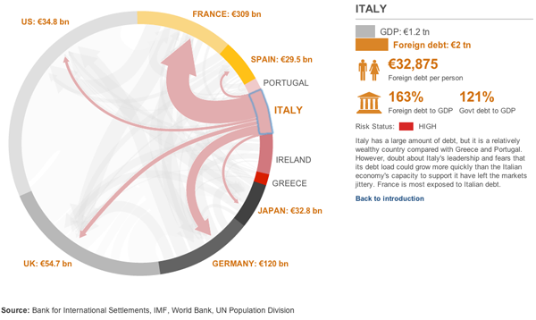
Now, the BBC has an interactive graphic showing how different countries relate to each other. The width of the lines relates to the amount of debt and the colours fall into three groups: red for high risk, yellow for medium risk, and grey for low risk. These are all fairly sensible and are echoed in the New York Times piece.

However, one advantage of the diagram used by the BBC is that the arrows emerge from an arc and show the total amount of debt going to the selected European (and US) economies. At least, I hope they do. That is how I read it, but it is not explicitly stated. I hope that I am correct. If so, this is better than the Times version which simply has a proportionally wide line starting from a circle. But without other lines, one cannot see the useful supplemental information about how much total trade the country has.
One element that sticks out is the selected state of the diagram. This uses a blue line that is rather crudely drawn atop the arc. Distractingly so. The colour choice works as blue contrasts with the reds, yellows, and greys, but the execution of the line drawing is simply poor.
Overall, the data is interesting, and if my assumption is correct, and presents a more meaningful picture of trade relations between the chosen countries. However, the execution of the piece’s design does leave me wanting more. And that, given the need to tell this story both completely and correctly, is unfortunate.
Leave a Reply
You must be logged in to post a comment.