Yesterday’s post was about the administration’s 2013 budget proposal as visualised by the New York Times. This morning we have a brief comparison to the visualisation of the Washington Post.

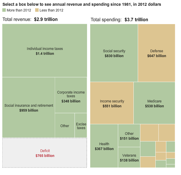
The main visualisation shows spending by department compared against revenue, the difference between being the grey box of deficit. Of note is that this piece also contains the revenue, and not just the spending, unlike the New York Times version. You can also see that the level of granularity is different; the Post looks only at department-level data while the Times delves into specific programmes. Critically, the arrangement of the budget components in this graphic makes it easier to attempt comparisons of area and thus weigh Education against Defence.

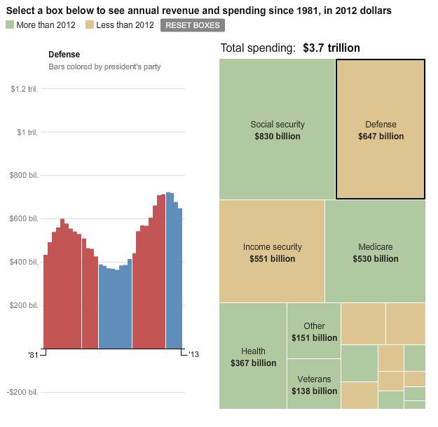
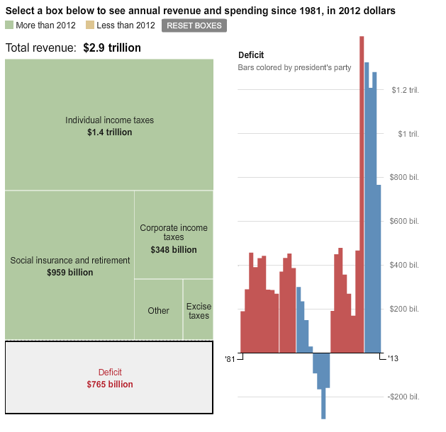
If you click a particular department, you swap out the revenue side of the budget equation with the details of previous spending in that area, broken down into presidential administrations that are coloured by party. The same holds true for revenue, clicking on those reveals the amount of revenue taken in by administration. Of some note is the deficit, which shows how we did briefly have a budget surplus back in the 1990s and how that compares to the deficits of today.

All in all, while the level of detail is not present in the Post’s visualisation, I find that the comparison at the departmental level stands strongly in the favour of the Post. The Post also benefits from presenting the other side of the budget story, revenue. Unfortunately, if you care to dig any deeper into any particular part of the budget, say weapons procurement or education grants, you cannot in the Post. That leaves space for a nicely designed, detailed, clear, and informative piece should someone or some organisation be so inclined to build it.
Credit for the piece goes to Wilson Andrews, Dan Keating and Karen Yourish.
Leave a Reply
You must be logged in to post a comment.