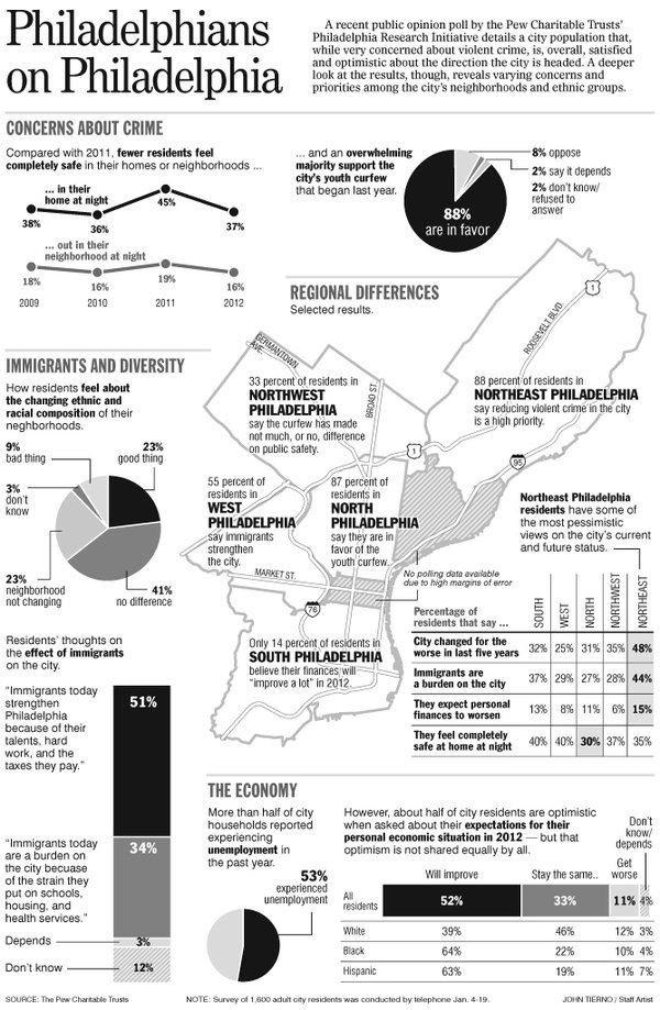
Yo, Philly, apparently Pew did a survey on what Philadelphians think about Philadelphia. And what better way to talk about a survey than through an infographic. So thanks to the Inquirer, that is what we have.

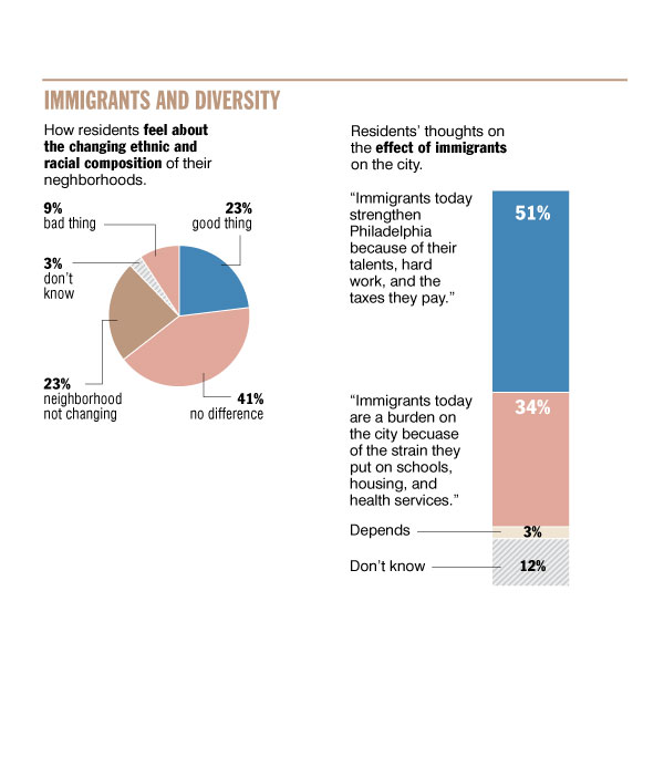
The interesting bit is that while there is a black-and-white, presumably print version, the website broke the whole graphic into its components and made them larger for web viewing. But, if you look at this example from the segment on immigration and diversity, they ought to have left colour alone. The two segments Bad Thing and No Difference use the same colour when they clearly do not mean the same thing. The black-and-white version keeps those two as separate greys.

Credit for the piece goes to John Tierno.
Leave a Reply
You must be logged in to post a comment.