From FlowingData comes a post to an interactive piece by Bloomberg that looks at the geographic distribution of different heritage—read heritage, neither race nor ethnicity—groups. (Its choice of groups, however, is slightly contentious as it omits several important ones, including African-Americans.)
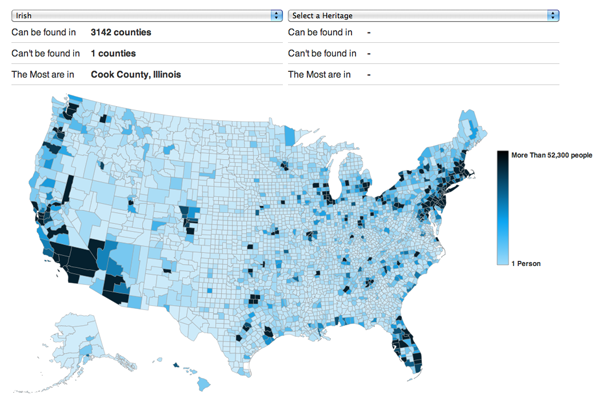
I would say that a typical map like this would simply plot the percent of each county, state, or other sub-division for the selected heritage group. Much like below, as I chose the Irish.

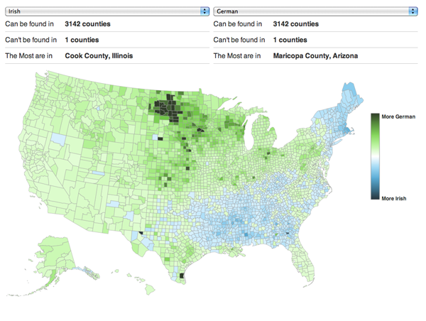
Bloomberg’s piece is a bit more interesting than that because of the ability to compare two groups, to see where they overlap and where they diverge. In doing so, they created a divergent choropleth that can show the subtleties and nuances of settlement patterns.

Credit for the piece goes to David Yanofsky.
Leave a Reply
You must be logged in to post a comment.