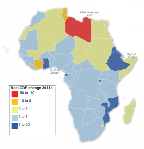
This falls under the just-because-it’s-about-geographies-doesn’t-mean-it-should-necessarily-be-visualised-as-a-map category. The Guardian has taken data from the African Economic Outlook, specifically real GDP growth rates, and charted them as a map. This caught my interest initially because of some work I have been doing that required me to read a report on African economic development in coming years. So I figured this could be interesting.

But it’s a map. That’s not to say there is anything inherently wrong about the map. Though the arrangement of the legend and size of each ‘bin’ of percentage values is a bit odd. I would have placed the positive at the top of the list and tried to provide an equal distribution of the data, e.g. 3–10 for both positive and negative values. But, without looking in any depth at the data, the designer may have had valid reasons for such a distribution.
That said, two finer points stick out to me. The first is Western Sahara. Long story short, it is a disputed territory claimed by different factions. I am not accustomed to ever seeing any real economic data coming out of there. But, according to the map, its growth is 0–3%. When one looks at the data, however, one finds that as I would have expected the data says “no data”. Ergo the green colour on the map is misleading. Not necessarily incorrect, for the growth could have been between those two points, but without any data one cannot say for sure.
The second concern for me is South Sudan—remember that story? For starters one cannot find it on the map; South Sudanese territory is depicted as part of Sudan. While South Sudan is one of the poorest countries on the earth, its split from Sudan is rather important. Looking at the data, one can see Sudan’s growth went from 8 to 4.5 to 5 to 2.8. Why the sudden drop? Probably because Sudan’s economic boom has largely been built on the boom in oil prices over the past decade or so. But, most of that oil is no longer in Sudan, Not because its been pumped dry, but rather most of the oil fields can now be found in South Sudan.
These are some of the contextual stories that make sense of a data set. But these are the stories lost in a simple, interactive map.
Credit for the piece goes to Nick Mead.
Leave a Reply
You must be logged in to post a comment.